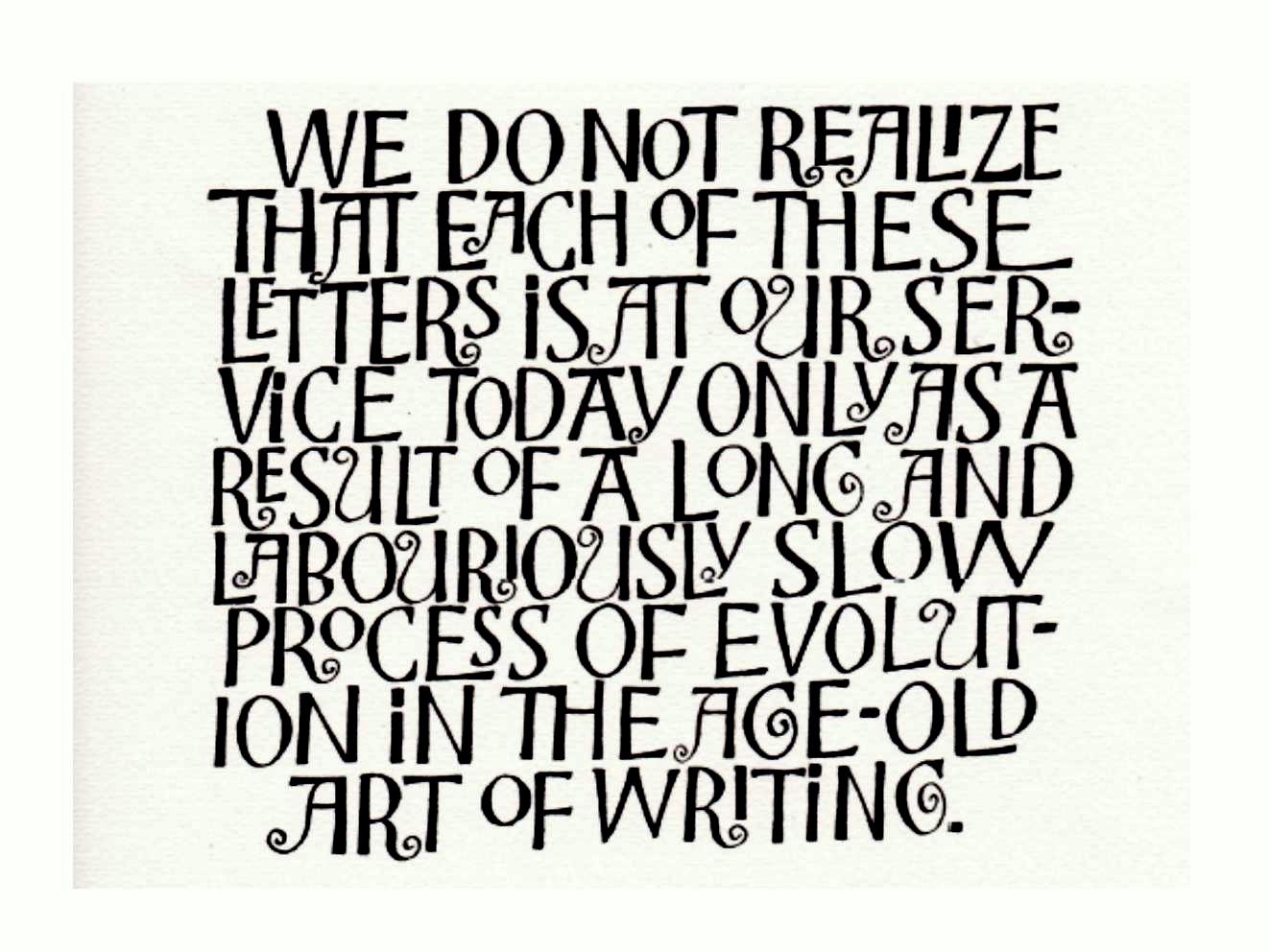
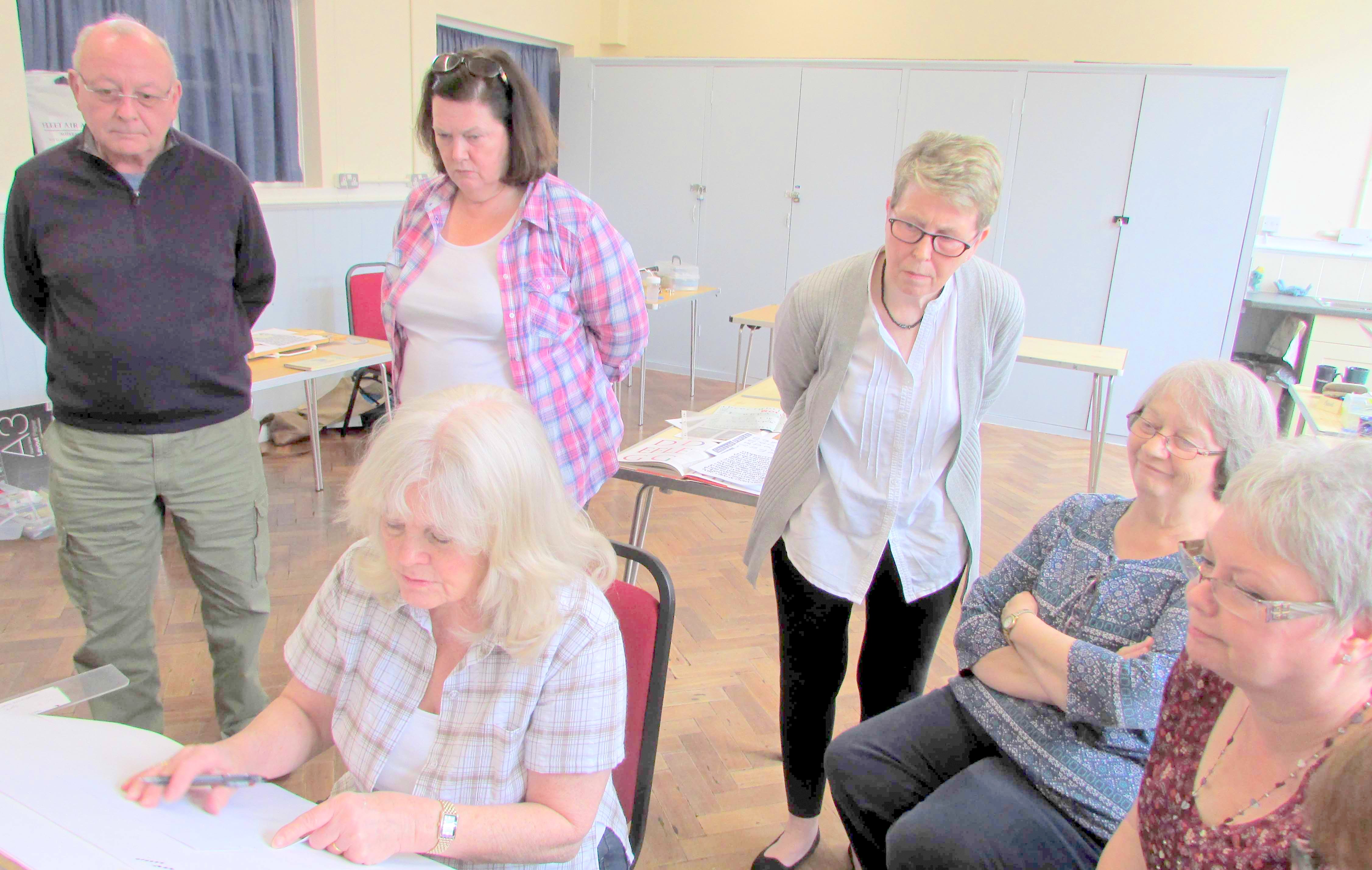
Workshop:
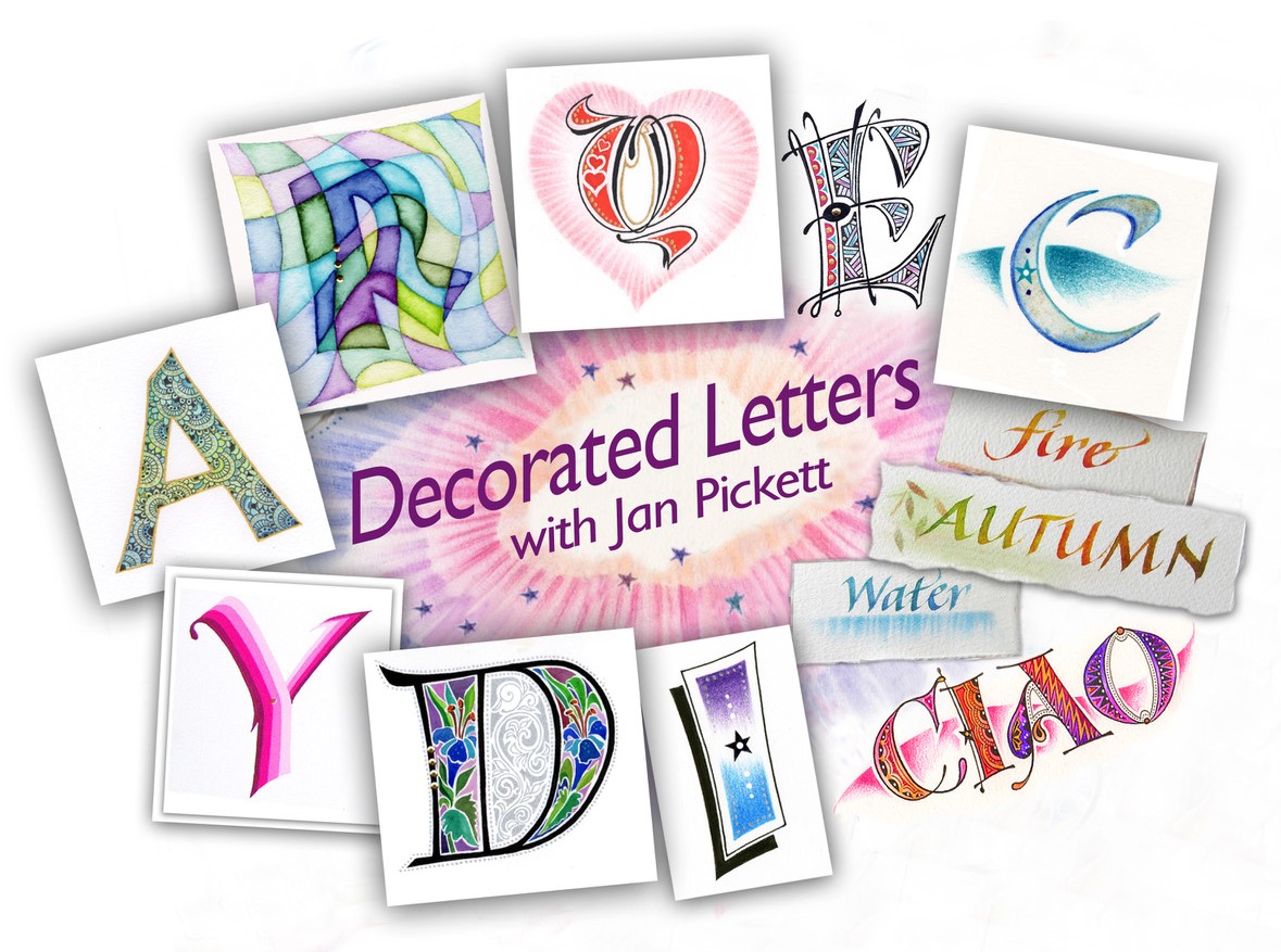
Jan Pickett, Fellow of CLAS and the SSI is a highly admired calligrapher, lettering artist and illustrator. Based in Portsmouth, she also travels all over the UK to present her workshops, and has also taught internationally in Finland, Japan, Australia and Norway and more recently in the USA.
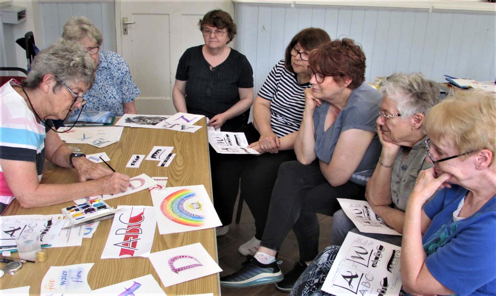
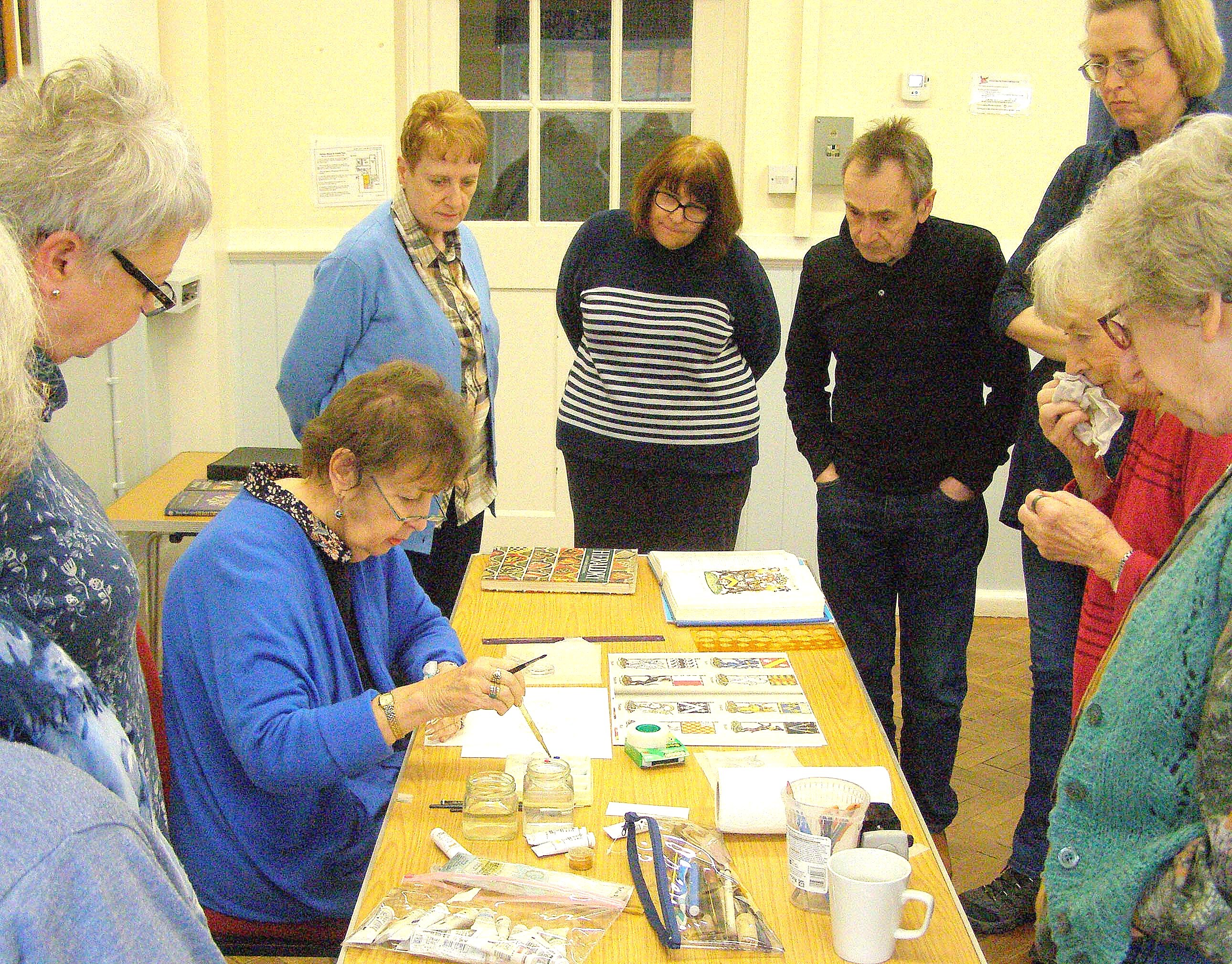
It was a real privilege and treat to welcome her to Lingfield Scribes for her workshop entitled Decorated Letters. Some of us had already adopted some of her techniques, others had read her books; we were all greatly looking forward to meeting her and learning from her in person.
Jan’s workshop was based on techniques shown in her book Decorated Letters, which shows you ways of illustrating letters using dry colour, wet colour and pastels. Any qualms we may have had about the thought of being able to reproduce her lovely designs, were dispelled by Jan putting us at ease from the start.
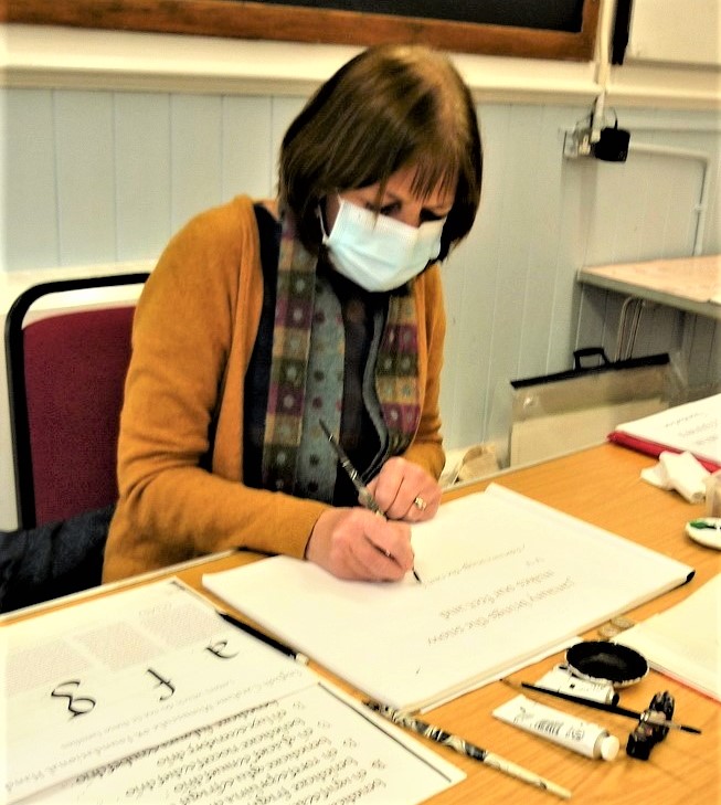
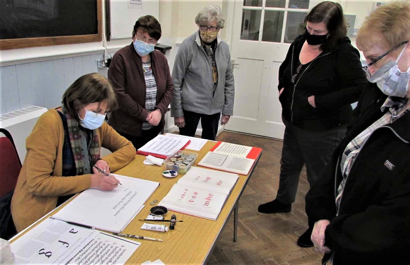
Watching a demonstration:
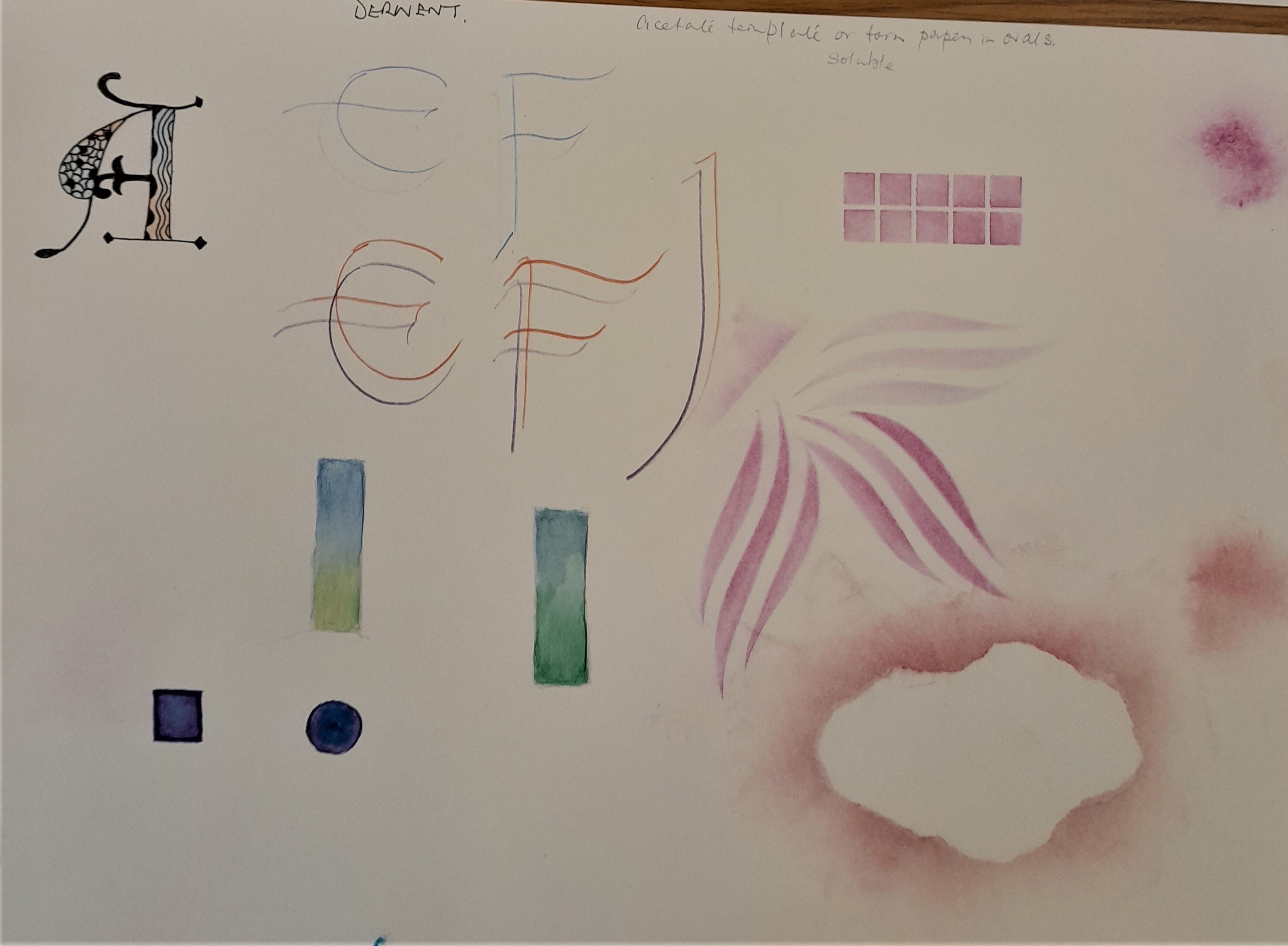
Wet Colour Technique – Using watercolour pencils
Primary Colours: Jan explained that there were six primary colours, 2 yellows, 2 blues and 2 reds and we learnt about the importance of selecting the correct ones for the colour we eventually wanted to create. For example, dark blue and red produce a brown colour whereas a lighter blue and red produced purple.
Shading and blending: We were asked to gently draw the shape of a letter on watercolour paper, using a soft pencil. Alternatively we could draw around card templates she had created for us.
Using watercolour pencils, Jan showed us how to gently shade one colour one side of the letter, and another colour the other side, leaving a gap in between. She emphasized the importance of holding the pencil well back to avoid pressing too heavily and the correct direction in which to move the pencil: left to right if we were right-handed, and right to left if we were left-handed.
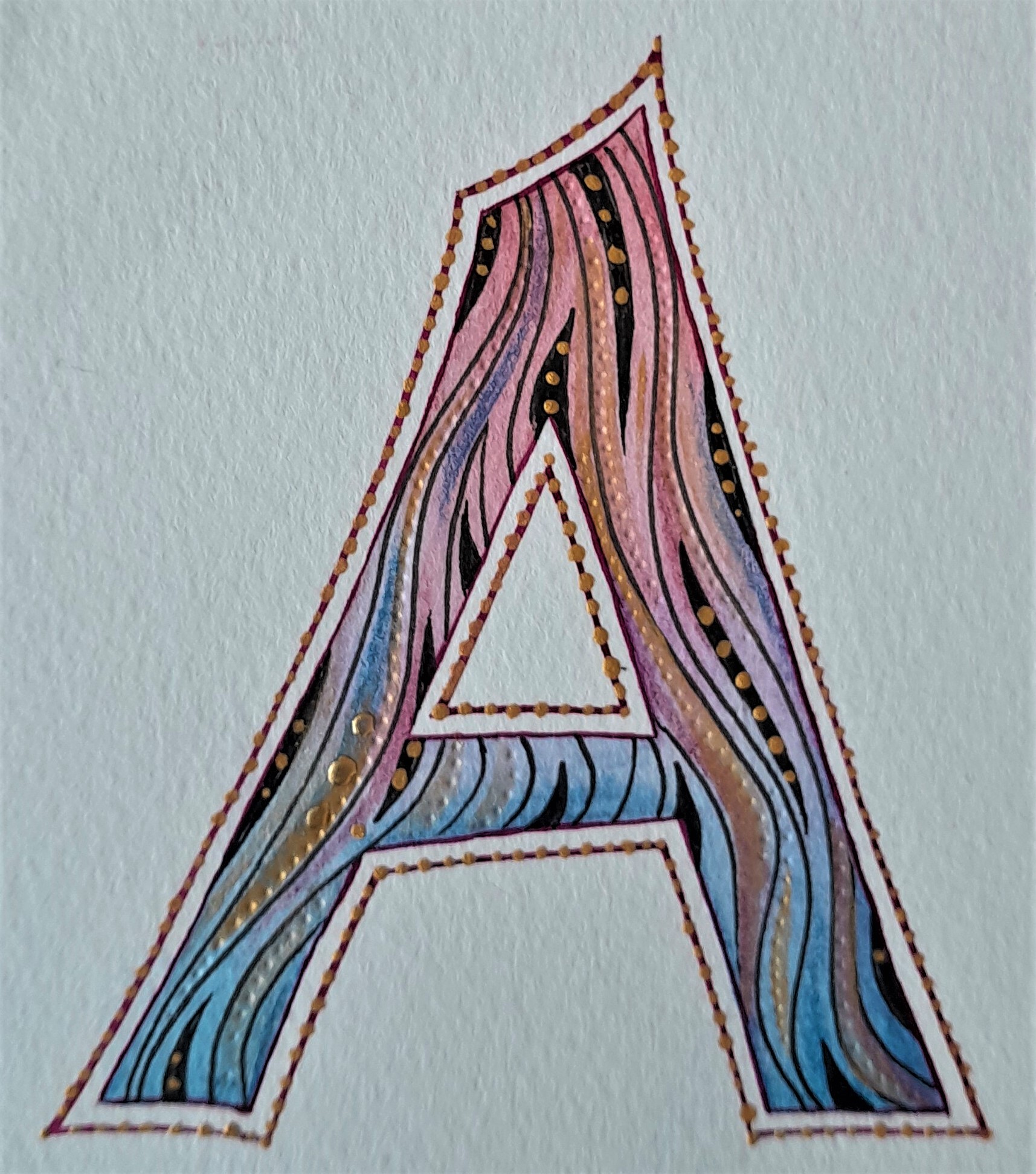
Next came the fun part of adding the water, strictly in the gap in the middle. Next we moved the water to one colour, working the colour well until it was nicely soluble and not stopping. It was a particularly hot day, so we had to work quickly to ensure the paint didn’t dry. Under no circumstances were we to add more water! Once the colour was soluble one side we moved it across to the other side to blend. This took slightly longer than we anticipated, but was well worth the effort when you could really ‘feel’ the colours moving and blending together. It was the first time I had used watercolours and Jan was very patient explaining this particular method to me, so I really benefitted from the experience. If you are new to this, start with a small shape or small letter, so you can see your progress quickly.
Once we had finished blending, we left the colour to dry. We could then select and plan which type of patterns to use.
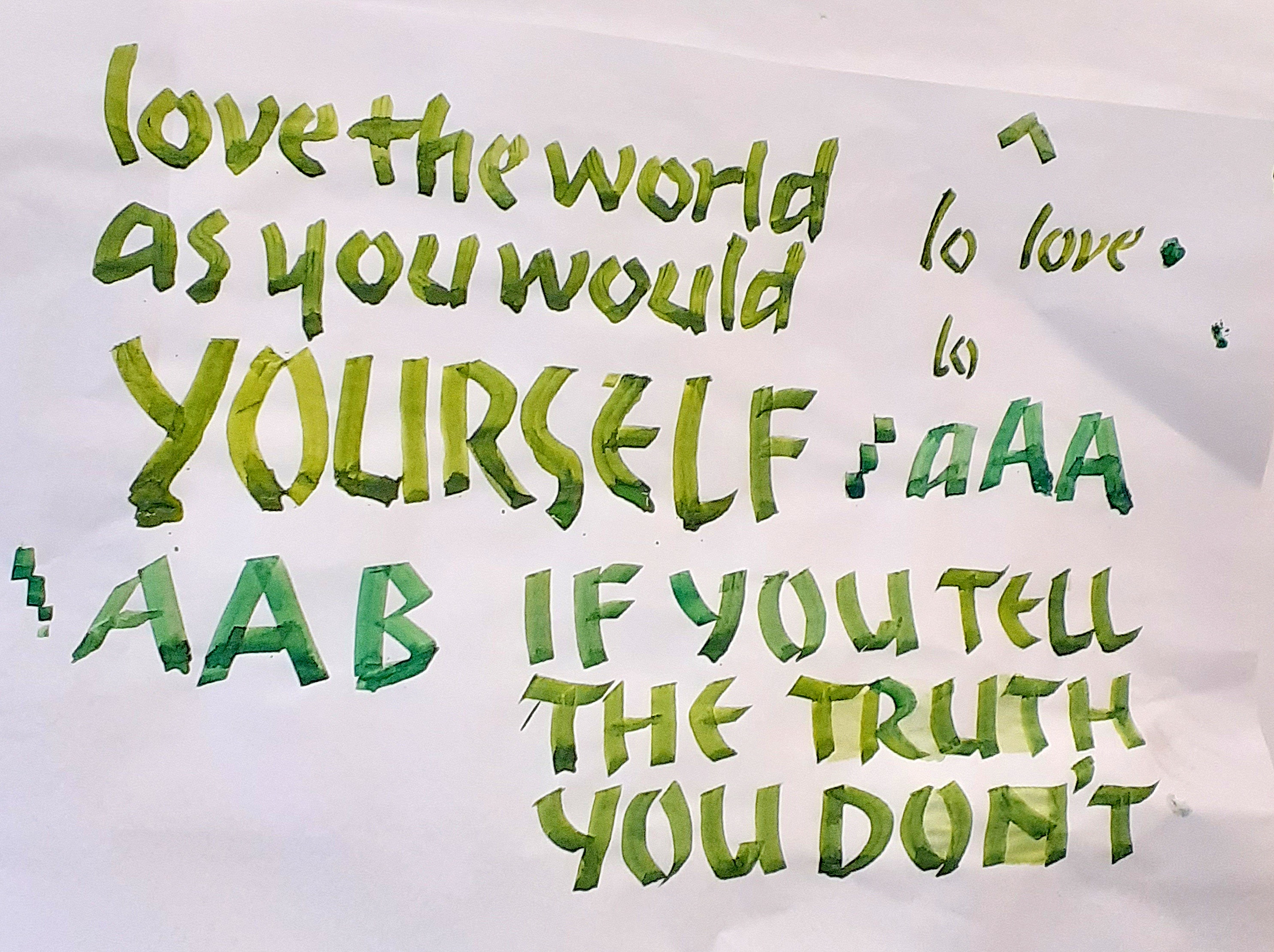
Simply swirls are very effective, or shell shapes, or long swirly lines. When the painted letters were dry, we used a fine black pen to apply the designs. Our letters now looked really alive, fun and the patterns ‘danced’ on the page! Perfect designs for that birthday initial, or illustrated letter for a poem. We could also add dots of gold gouache for added sparkle!
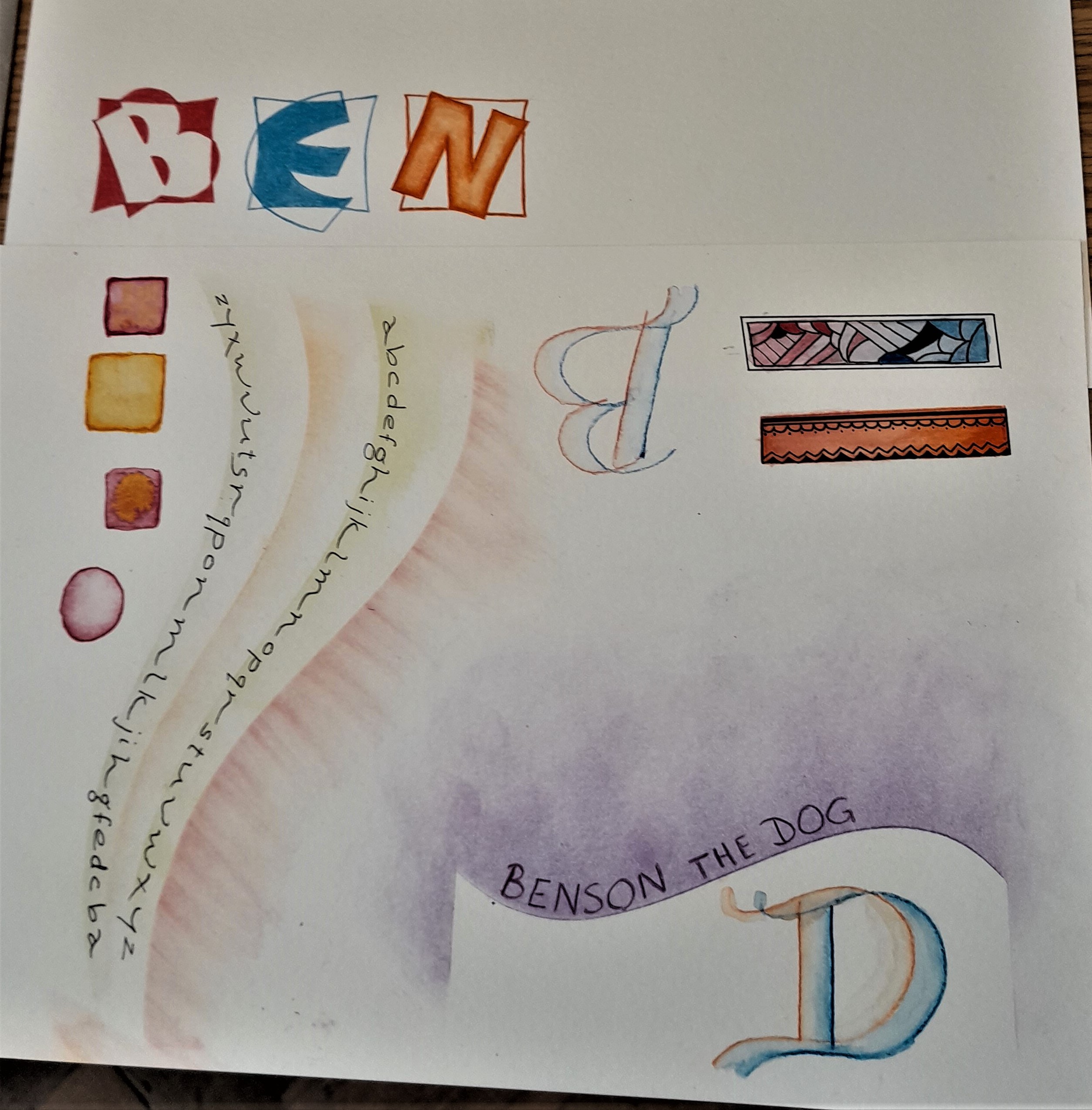
Jan’s examples:
This technique lends itself to illustrating Lombardic capitals or large monoline letters.
Jan’s example:
Jan showed us how to make patterns using more than one letter, for more impact. We could arrange four letters in a clockwise pattern, or letters could be placed in a curved pattern. Jan’s remarks on our work were very encouraging!
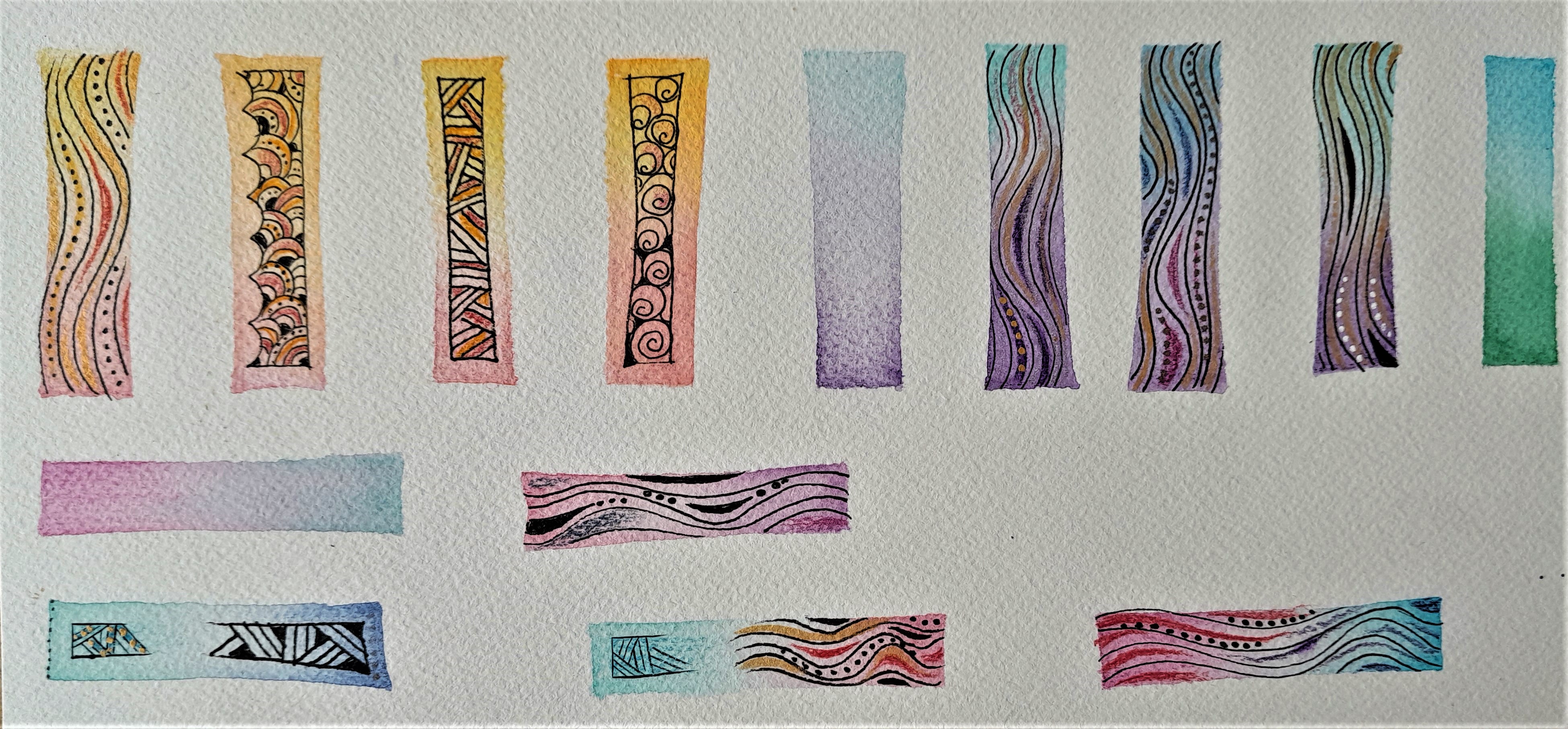
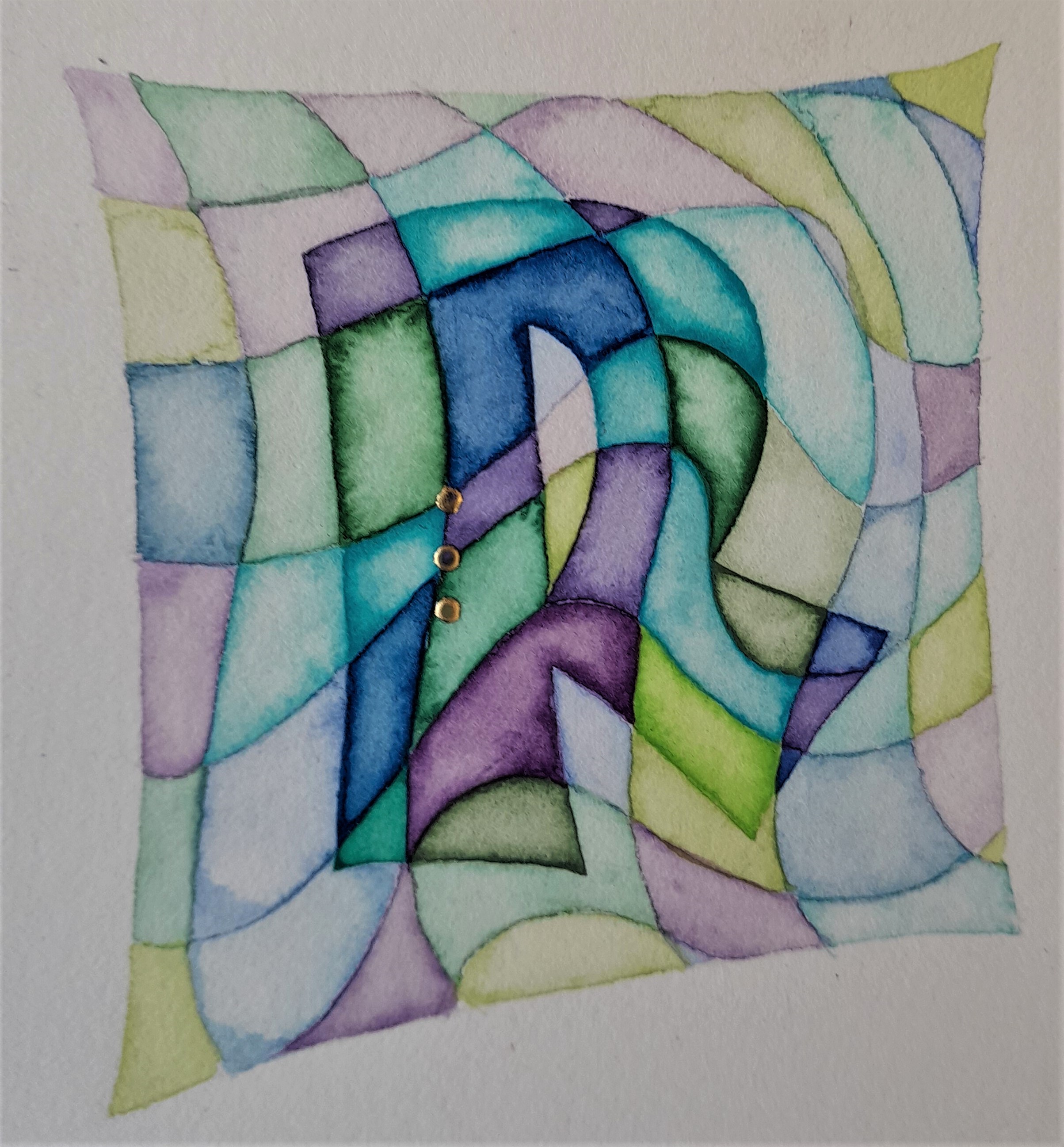
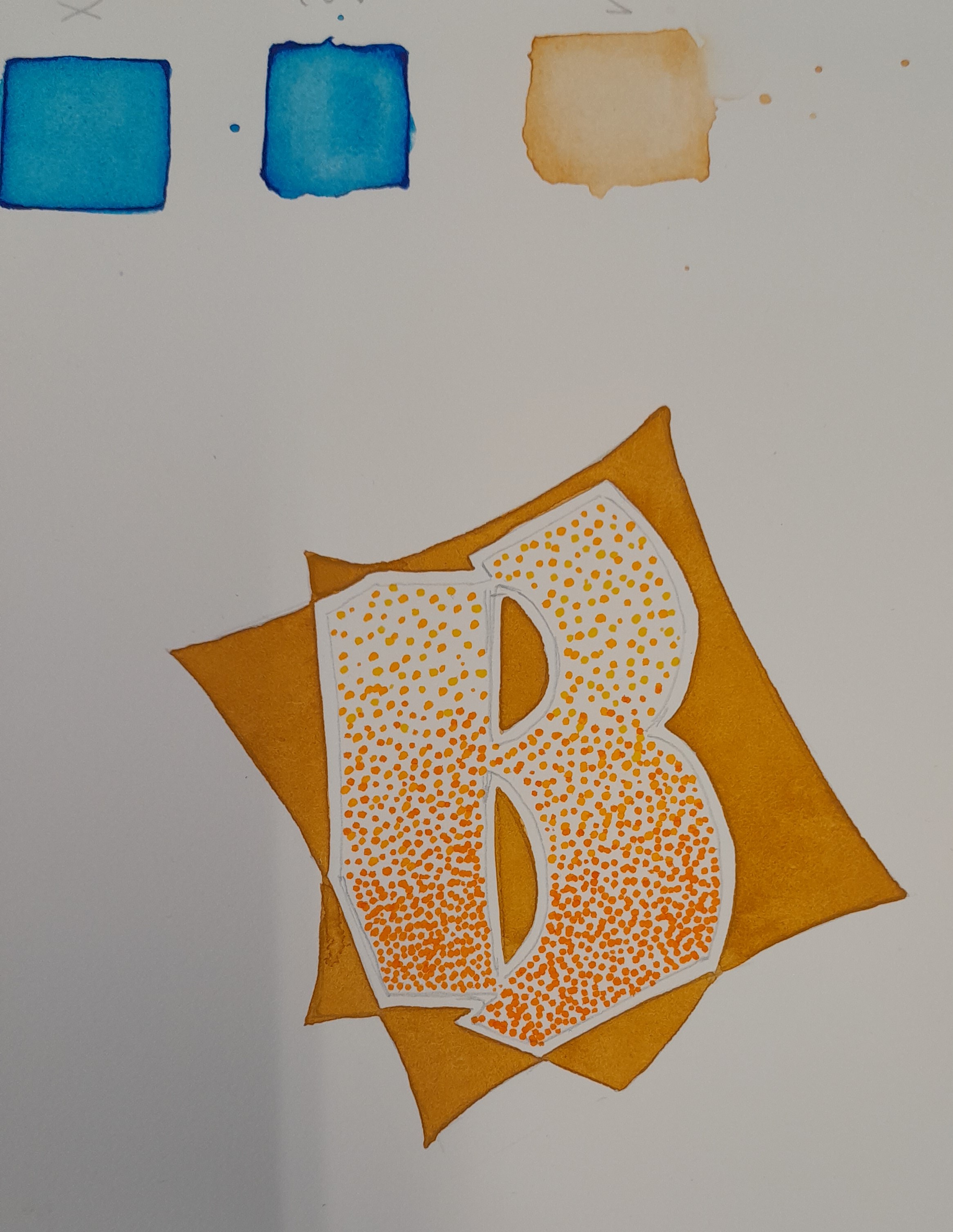
Colour Lift Out
An extension of the watercolour technique was to create a fading colour effect by lifting out colour from the centre.
We drew a small square using watercolour paint in one colour, applied paint over the whole area and then using a thick brush, lifted out colour from the centre. As capiliary action naturally draws water to the centre, we had to keep drawing out the colour without stopping, in case the paint dried.
N.B. Always use standard watercolour paint for this and not the pearlescent, as the pigment does not work in the same way and you will end up lifting all the paint out and have a blank centre.
To add interest to the finished square Jan showed us how to bleed in tiny drops of a different colour or add gold paint for a glitter effect.
Jan’s example:
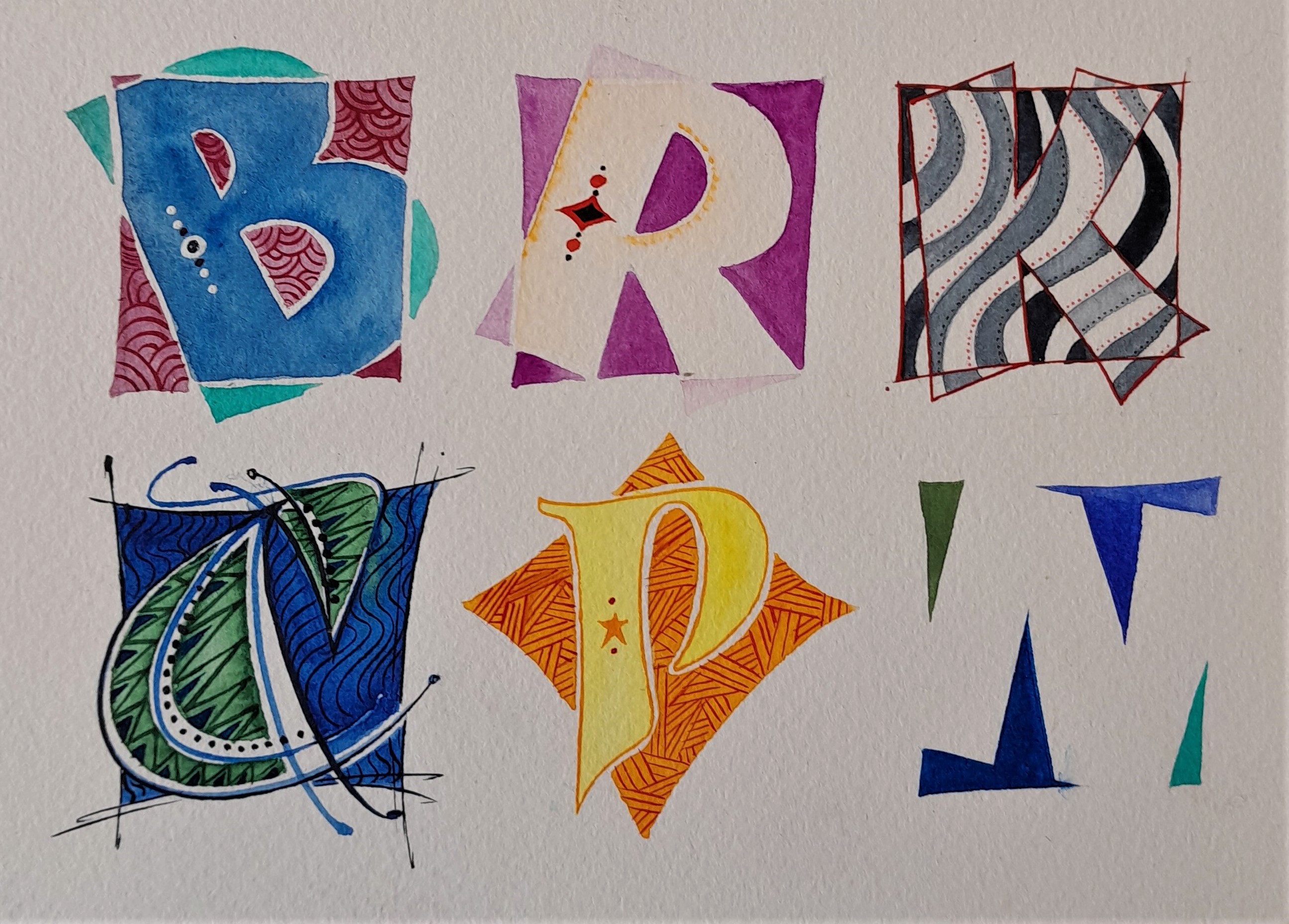
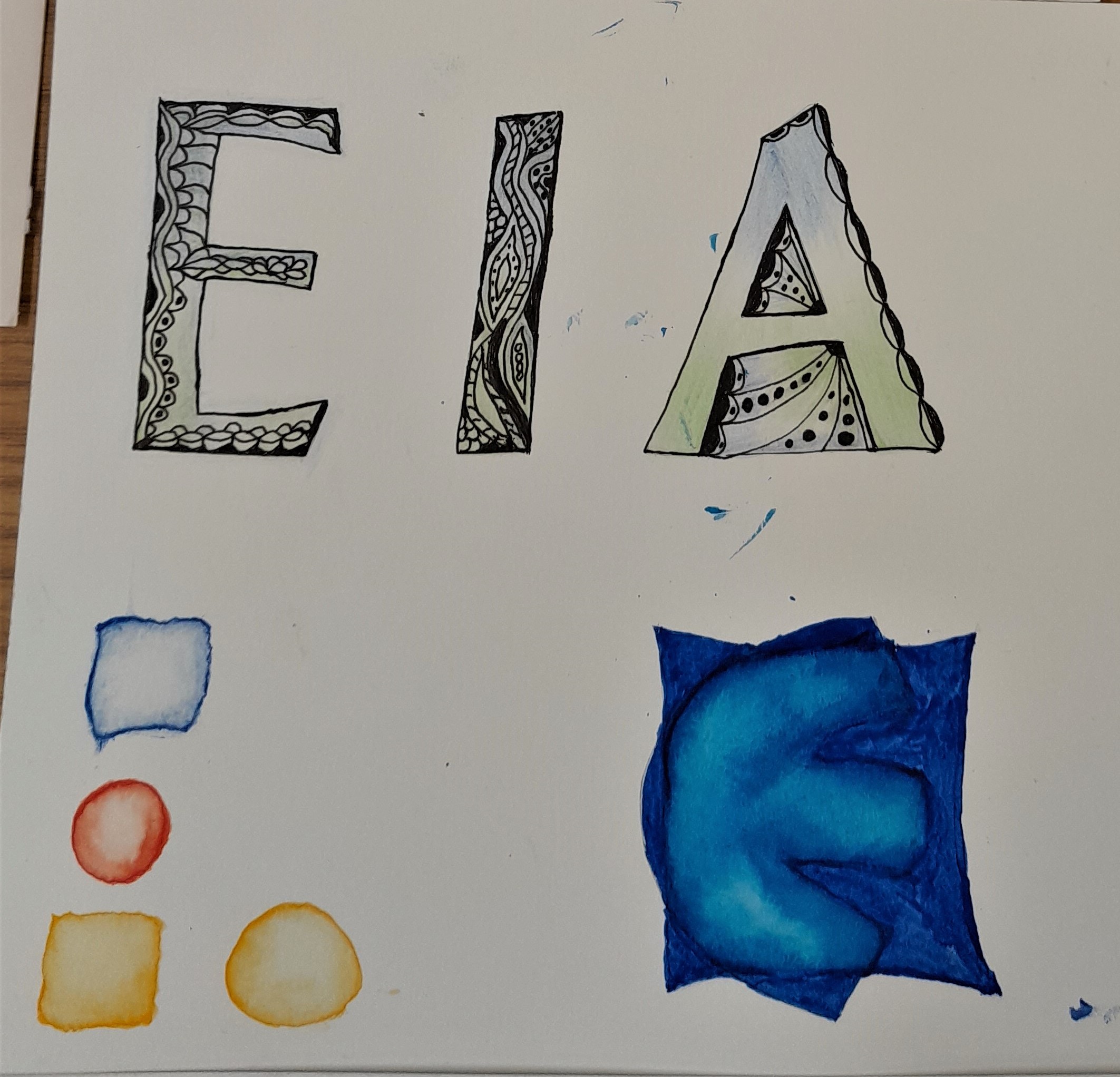
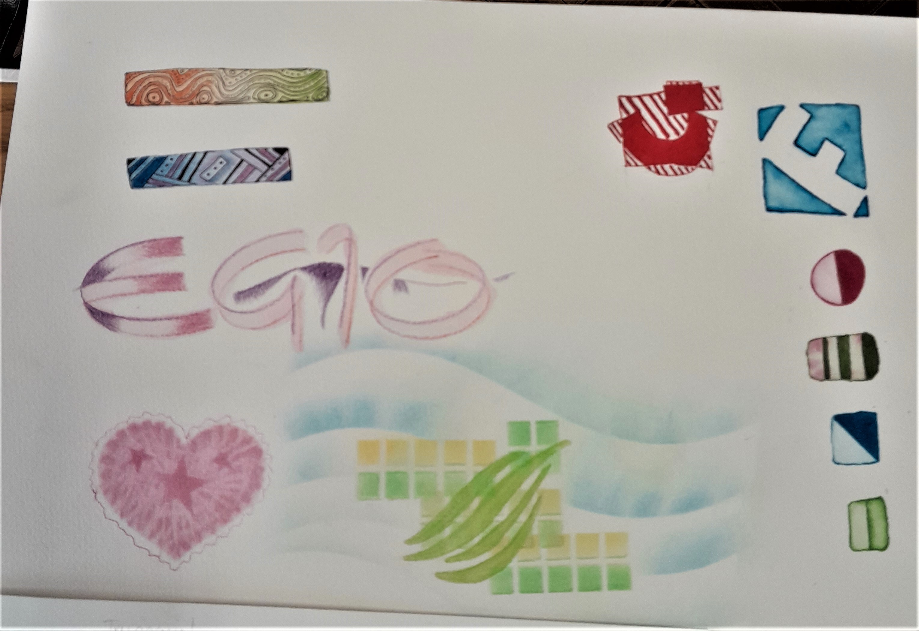
Letterbox Letters
Another fun activity was letter box letters, drawing a letter within a small square and either shading in the colour around the letter, or colouring the letter itself. This creates a lovely modern effect, particularly if the letters are positioned at an angle.
Jan’s examples:
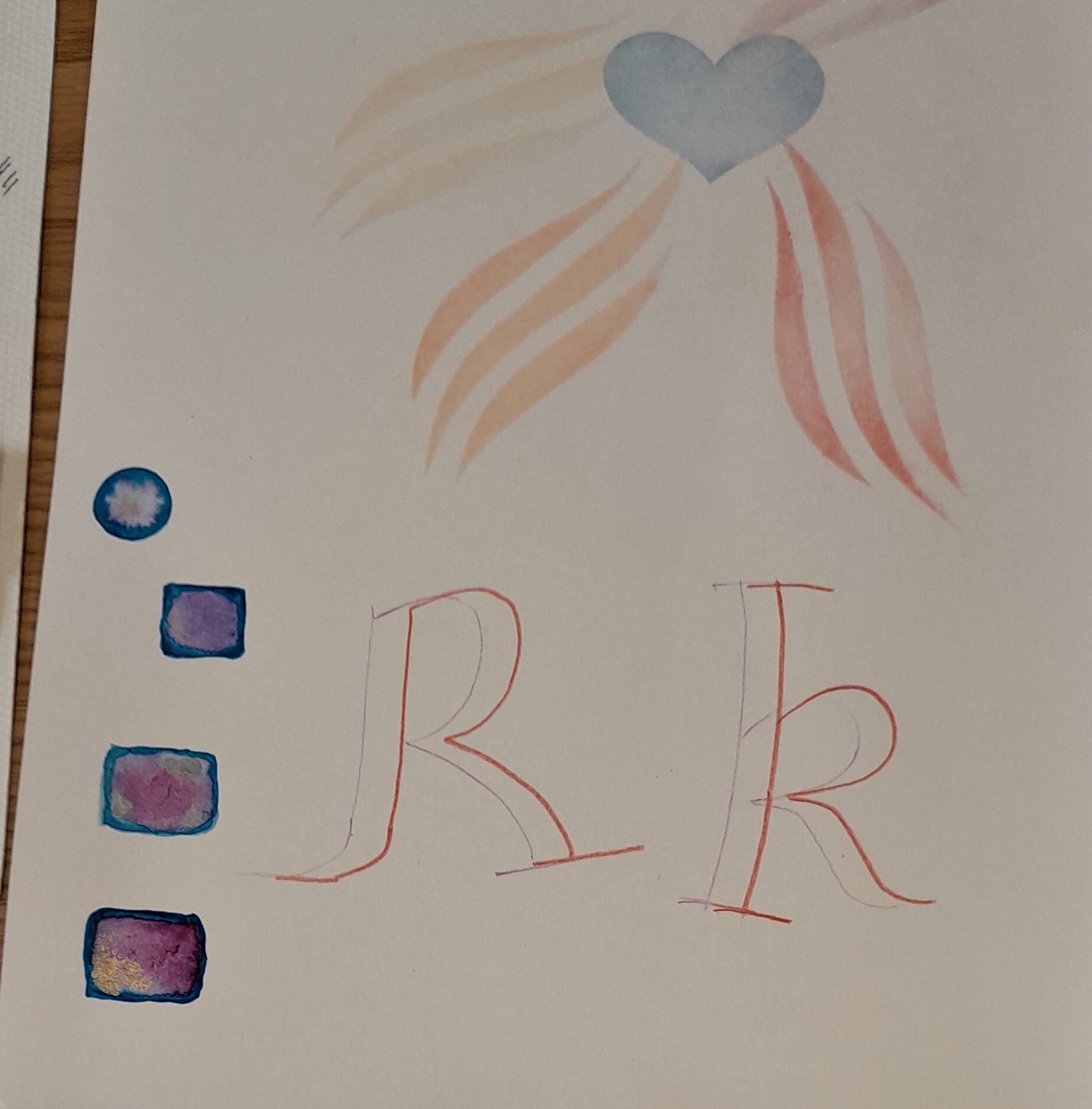
Dry Colour Technique – Pastels
Pastels are always fun to use and can create dramatic backgrounds on which to write calligraphy.
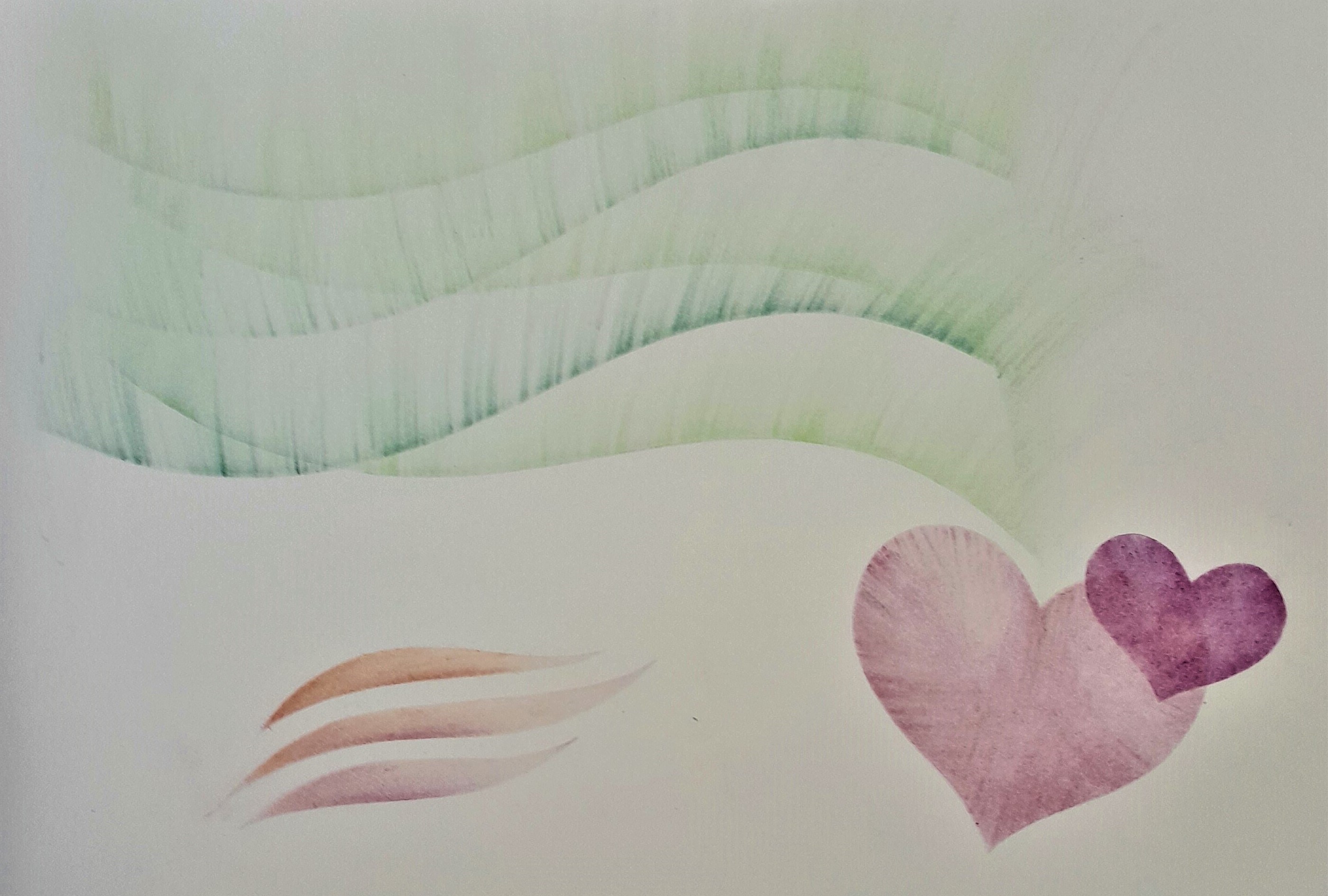
Jan showed us how to use cloud-shaped stencils of graduated sizes to develop a colourful pattern, using a craft knife to shave the pastel over the area we wanted to apply colour and then using cotton wool to apply the colour, working in a clockwise fashion to ensure even distribution. She then demonstrated how to cut an eraser and use it to create a sunray effect. It was important to make sure the rays were closely together, for the desired effect.
We also learnt how to apply colour around the shape of a stencil, rather than in the centre. For example using a heart stencil. A more sophisticated technique was using a stencil with a wave pattern and delicately applying the colour carefully, so as not to move the thin stencil strips. The tip for this was to blend the pastel colours on a separate sheet and then carefully apply them to the gaps in the stencil.
Examples:
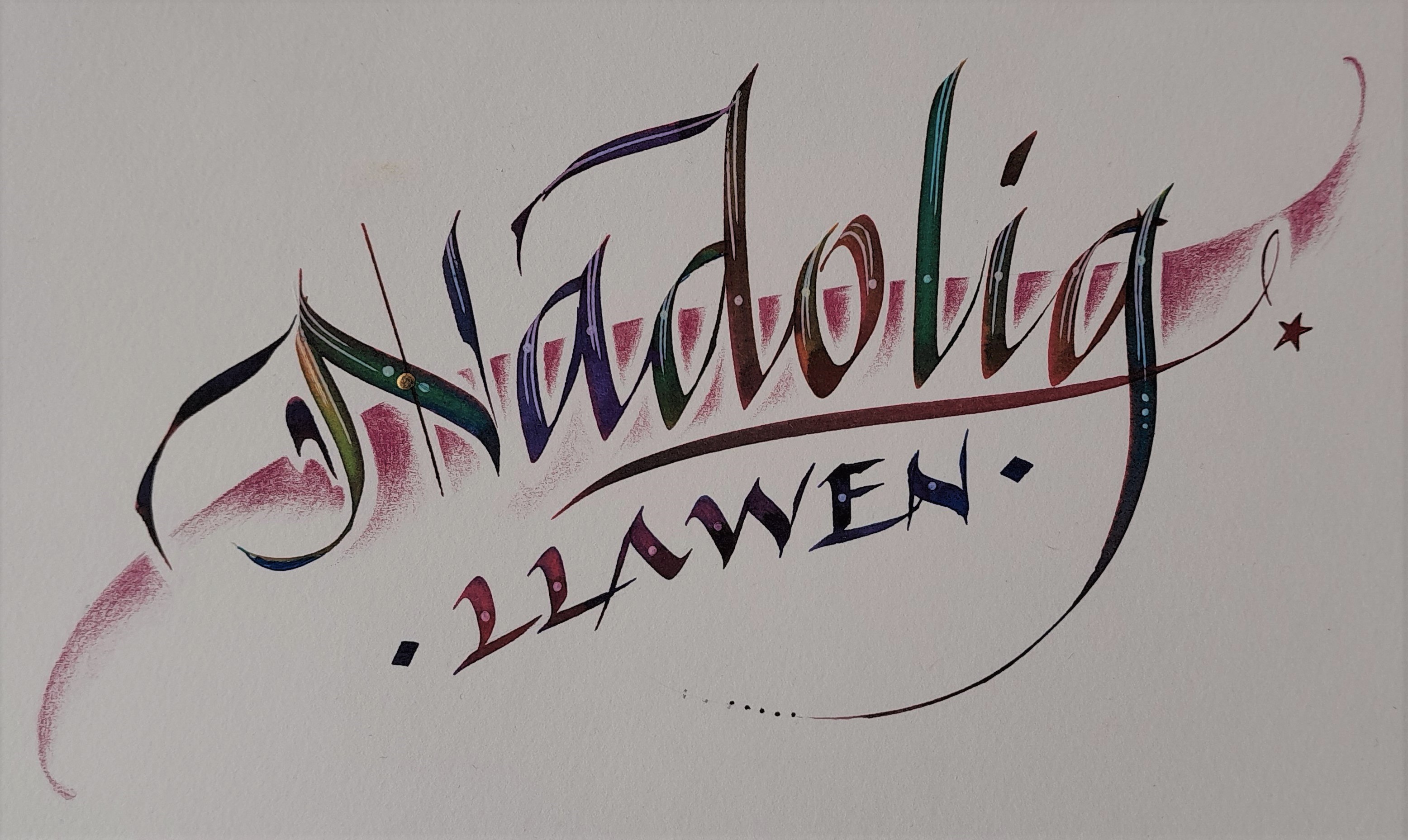
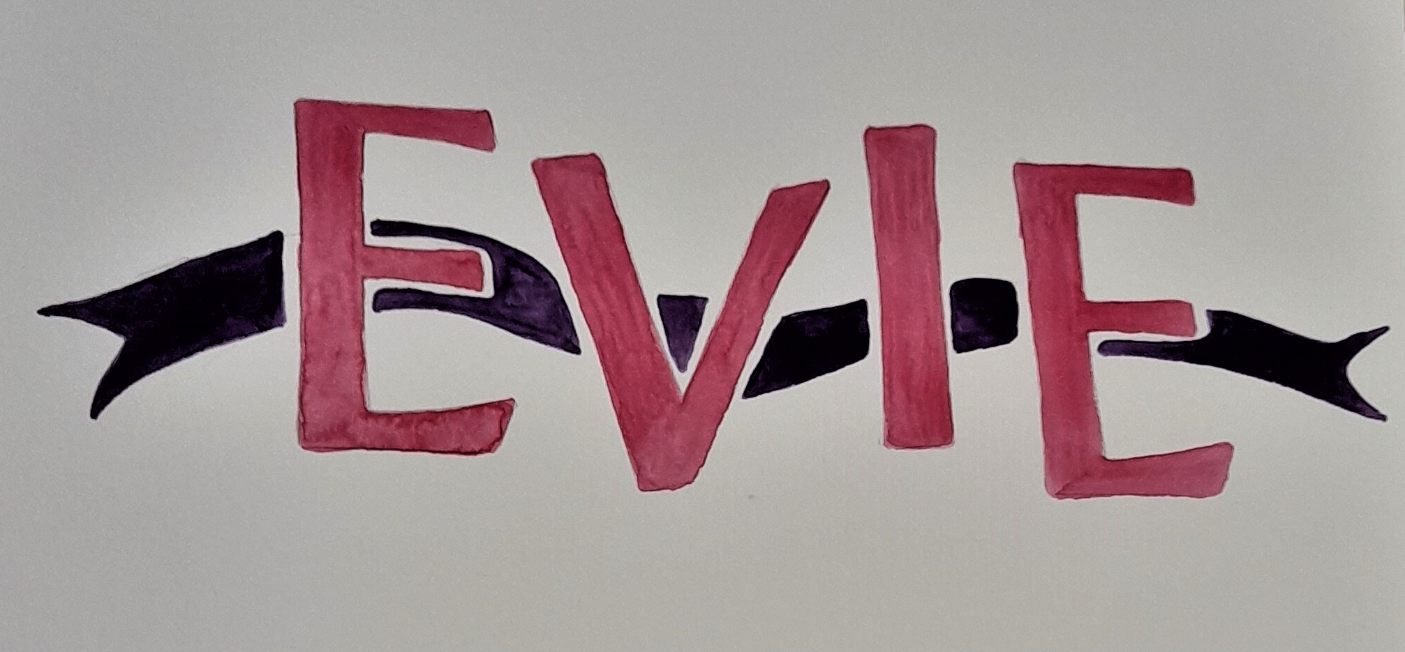
Banding
Finally we learned how to apply a band of colour behind letters we had written.
Letters are drawn first and then the shape for the band of colour lightly drawn and then painted in.
This created an almost 3D effect, and is a really simple and effective way of creating a design for a card or the title of a piece of work. Jan made it look so easy and this is certainly worth practicing and perfecting.
Jan’s example:
Students’ Work
At the end of our workshop we presented our completed work and Jan complimented us on how well we had applied the different decorative effects.
We came away, having learnt so much, and really keen to start applying our knowledge in future calligraphic work! Thanks Jan for a really super day!
******************
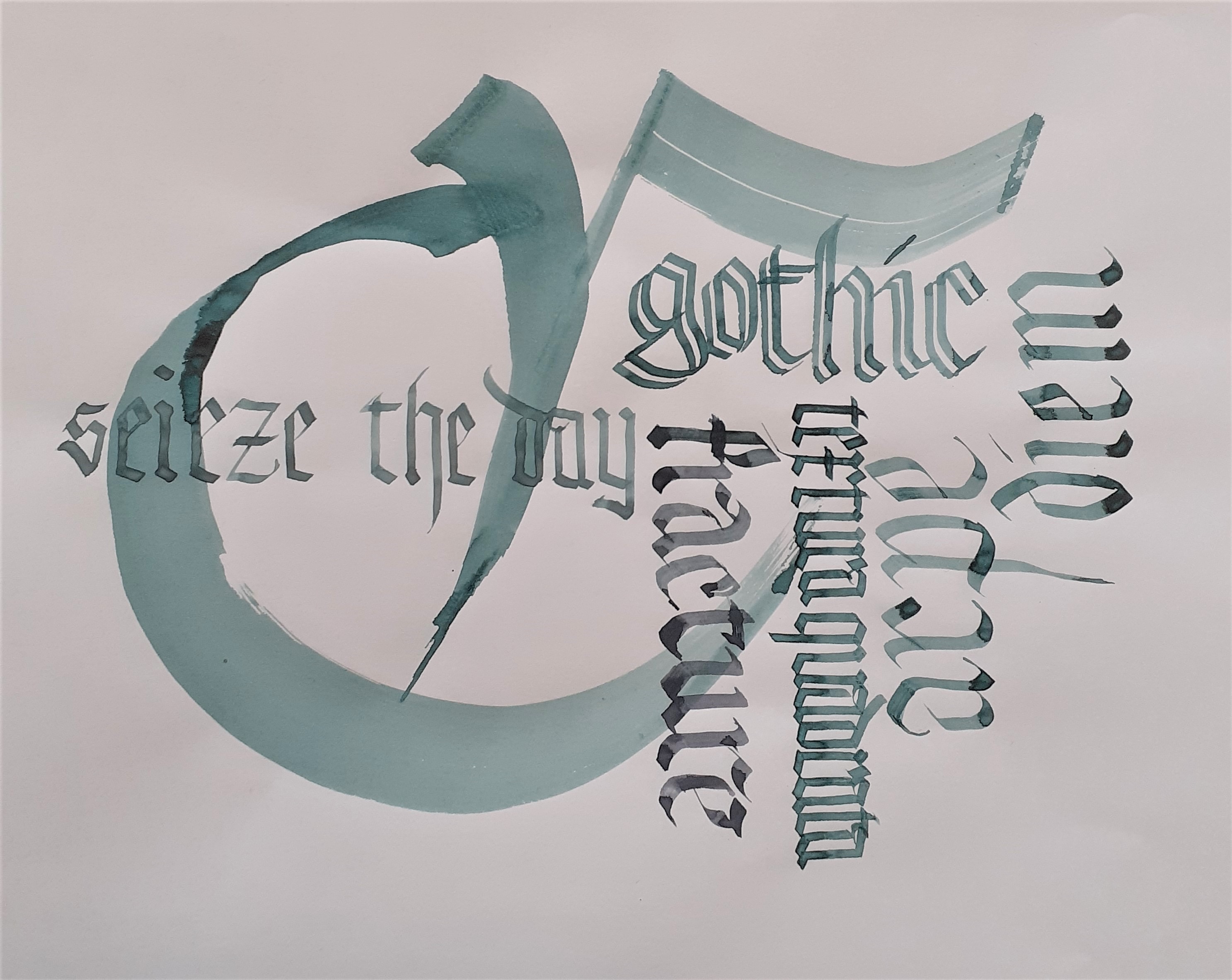
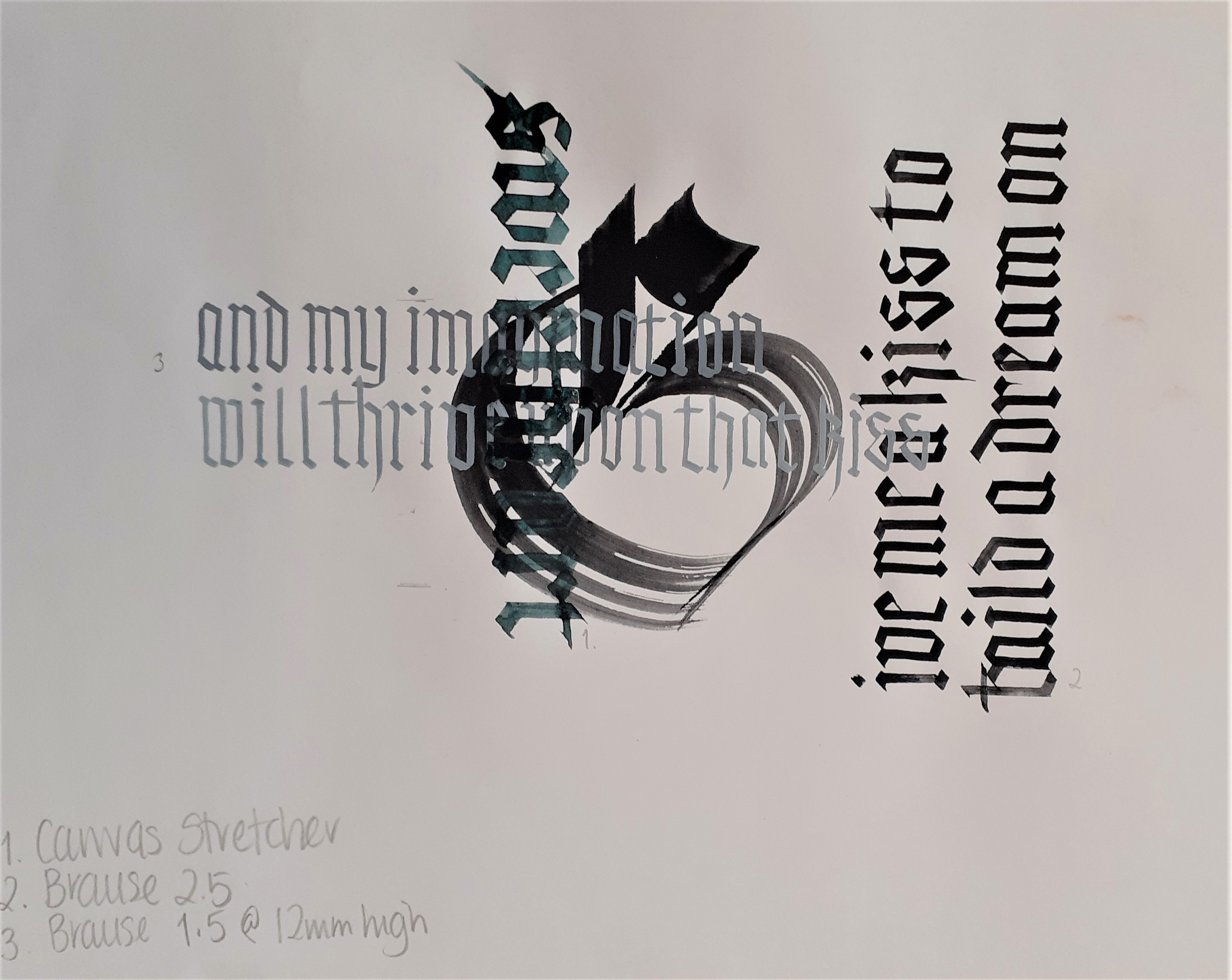
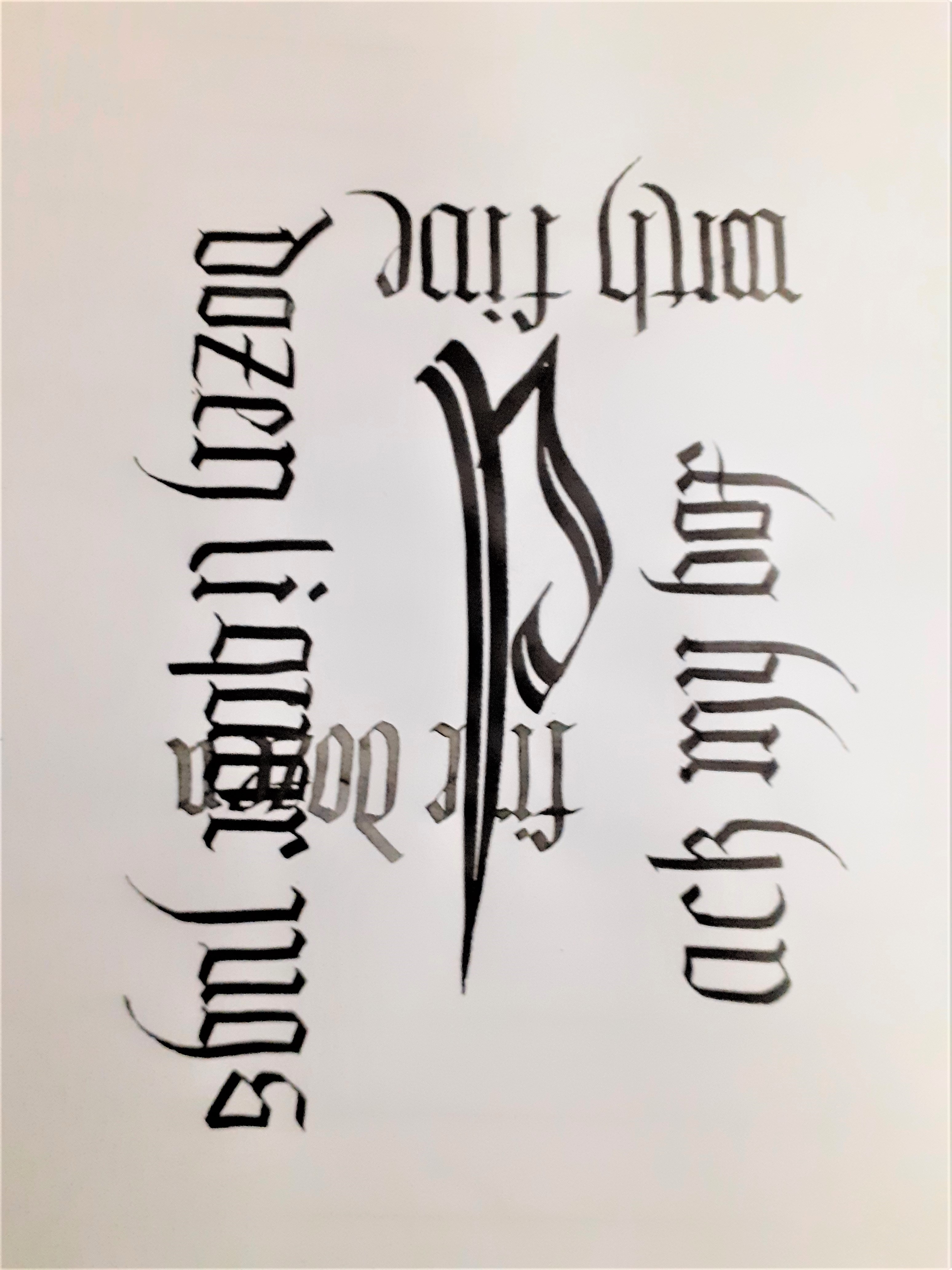
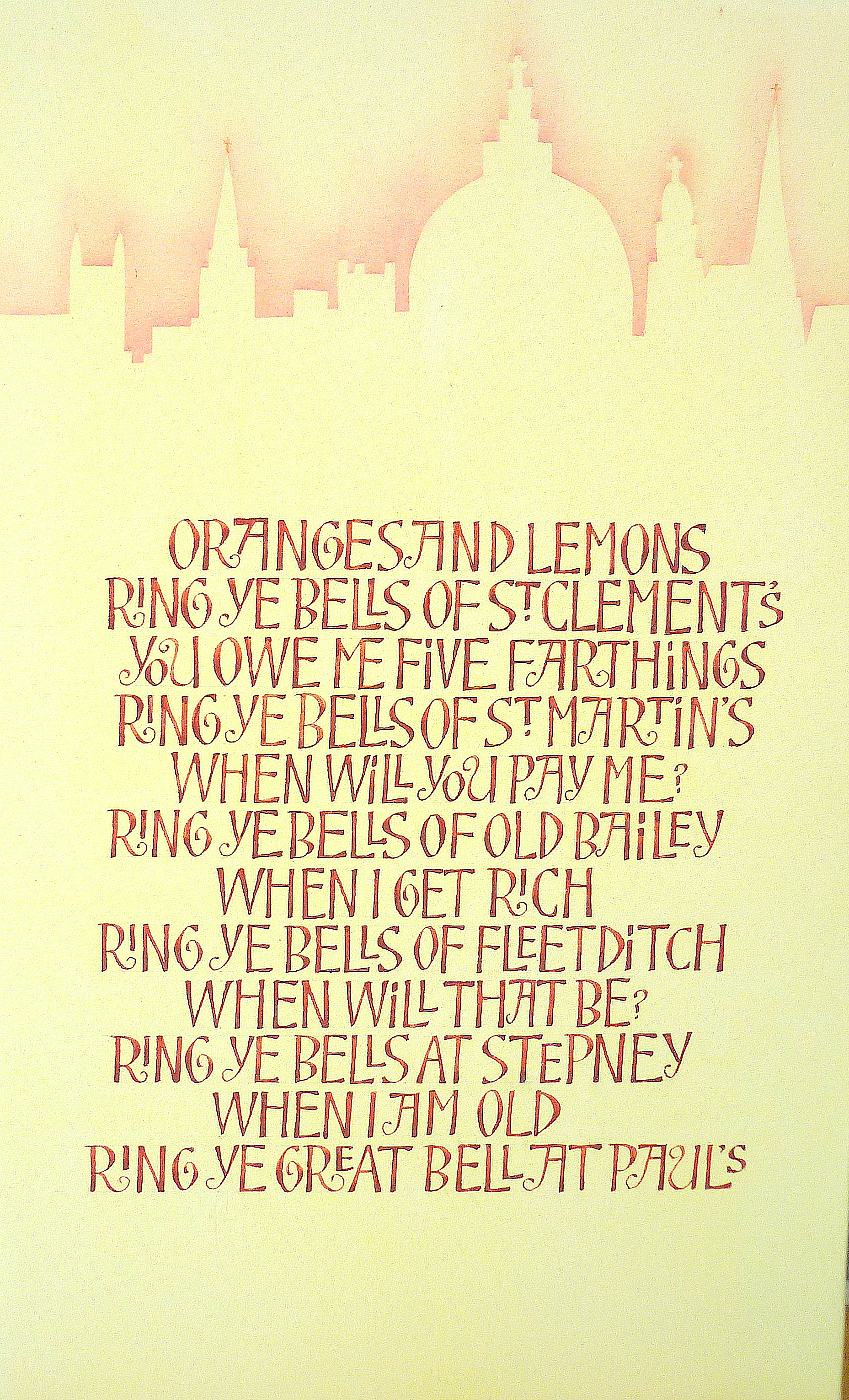
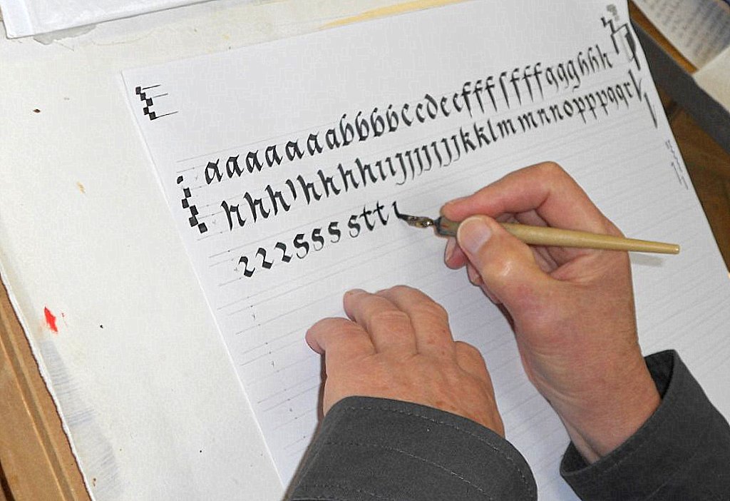
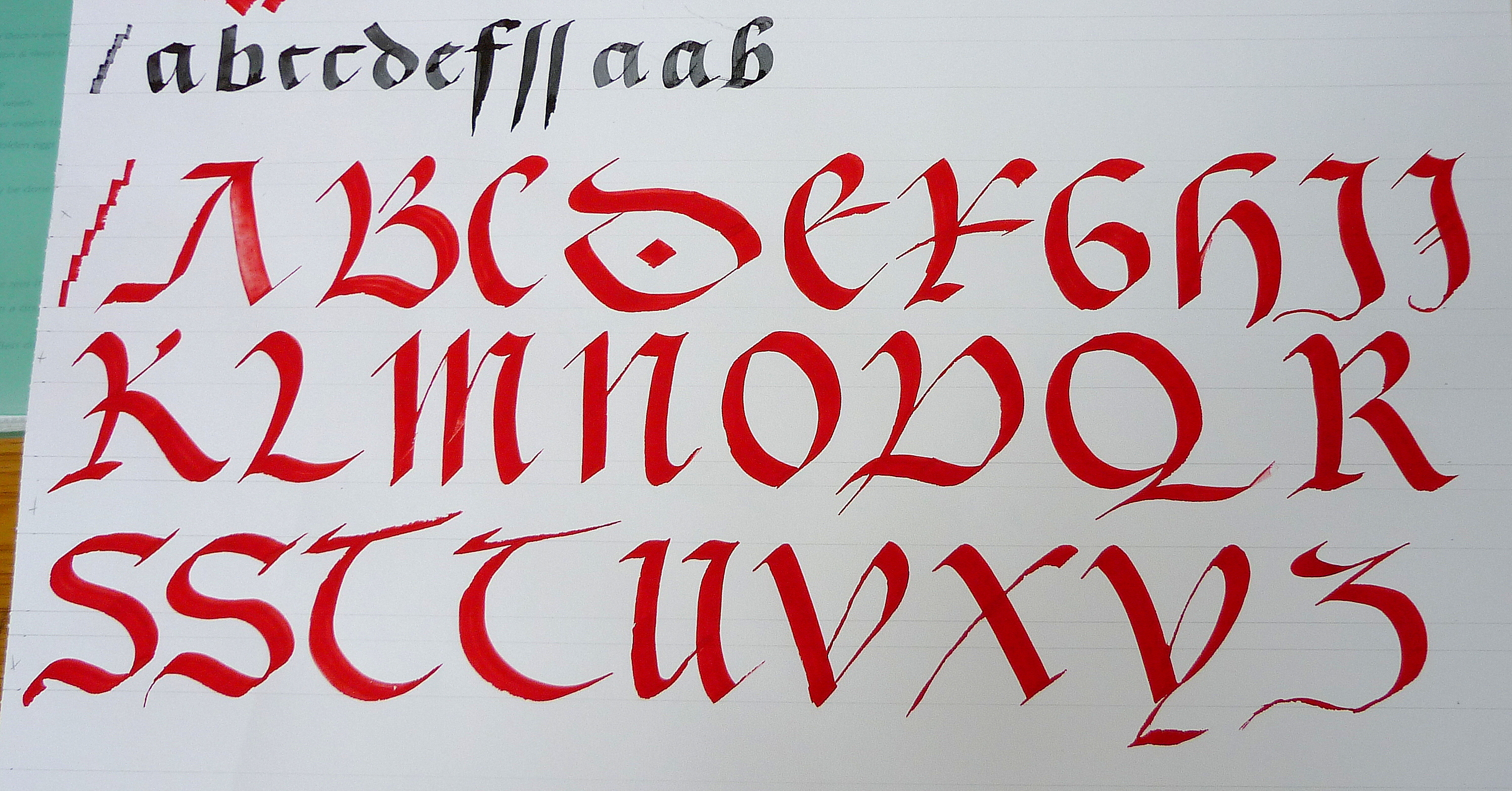
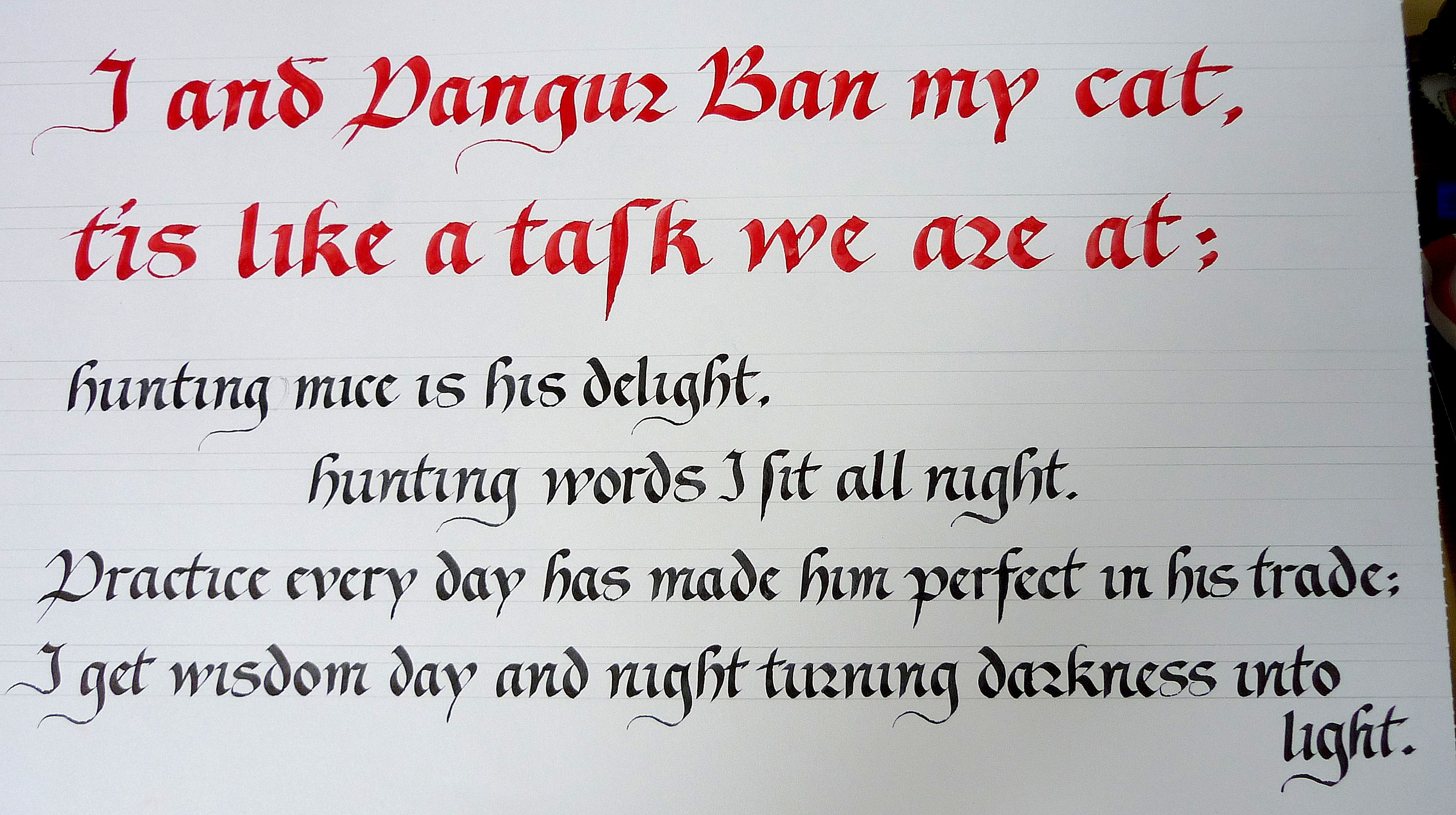
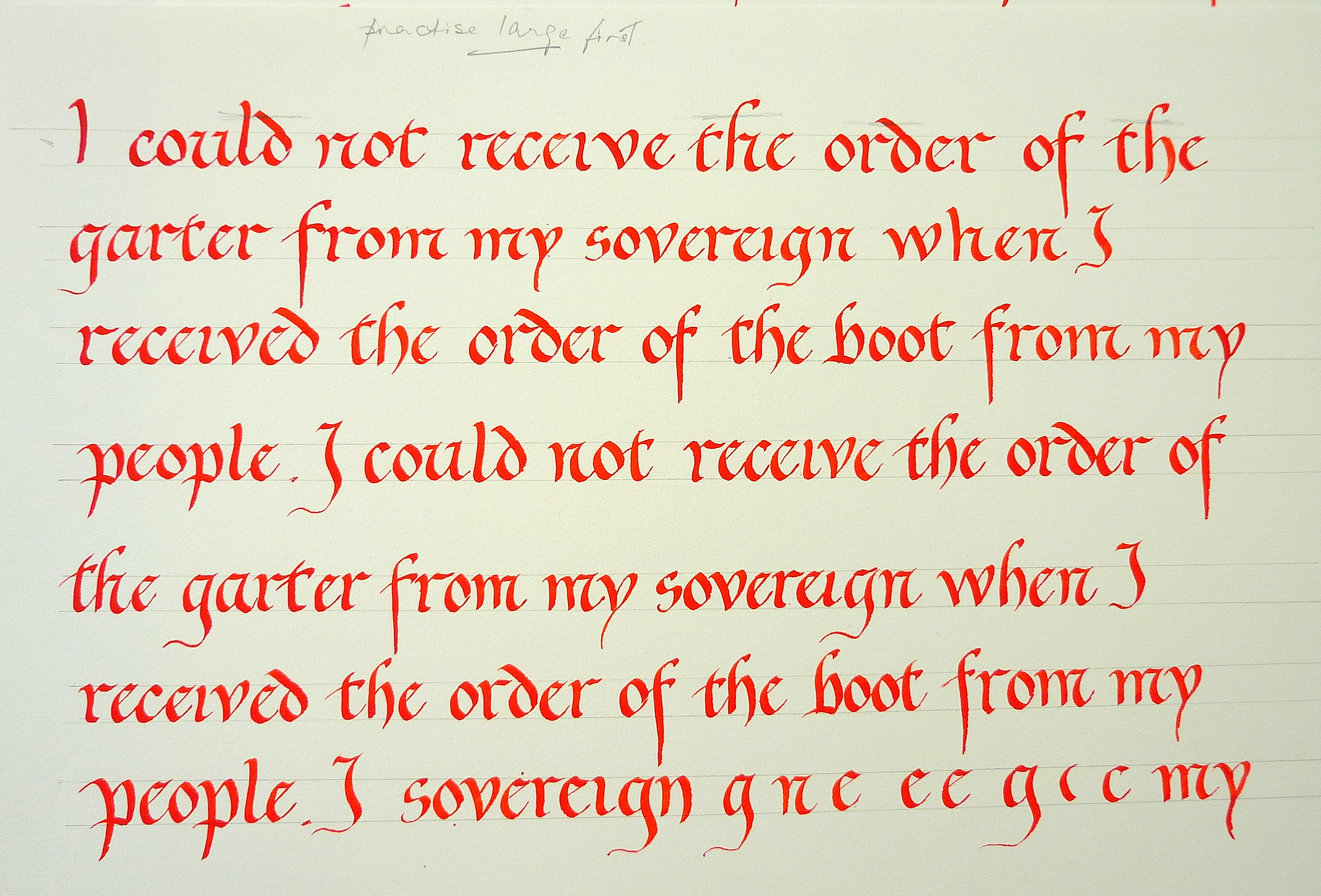
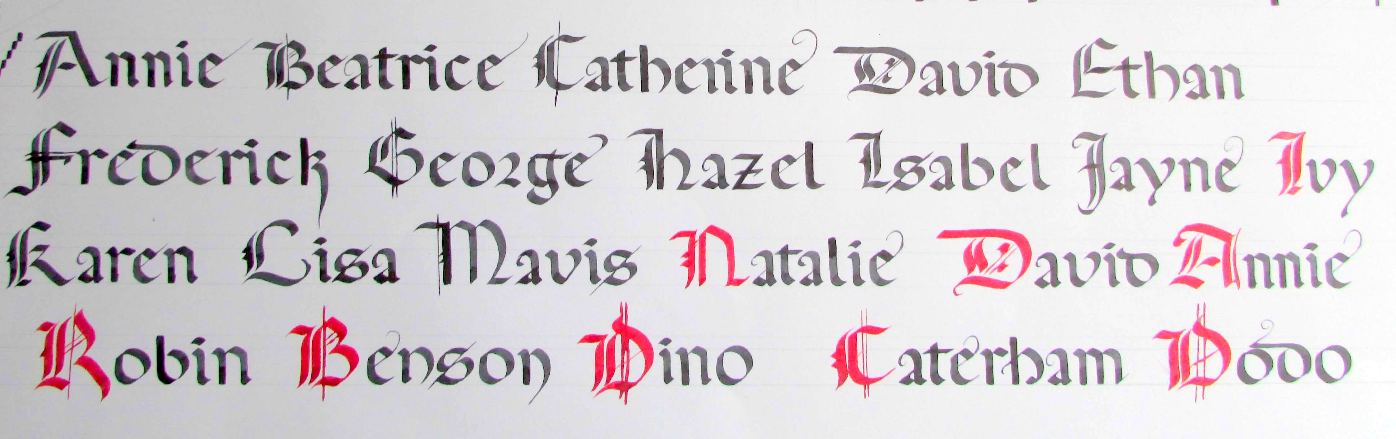
Julia Baxter’s Workshop on Modern Gothic
Julia provided exemplars of Modern Gothic script and capitals, together with a lined sheet to save us time on drawing them up. We practised until we began to gain confidence and then moved on to writing text blocks illustrating different weights, spacing and movement in the letters.
In the afternoon we worked on a project of Julia’s devising, here are the results:
******************
Cathy Stables’ Workshop on Foundation Hand
From one of our newer members: “I’m just reflecting on Saturday’s workshop and want to say how much I enjoyed and gleaned from it. As someone who is just embarking on calligraphy, I came away from the course filled with great enthusiasm for this craft. I am very grateful to Cathy for all her encouraging remarks and very useful tips. The course was well-paced given by a tutor with such expertise and having time for everyone.”
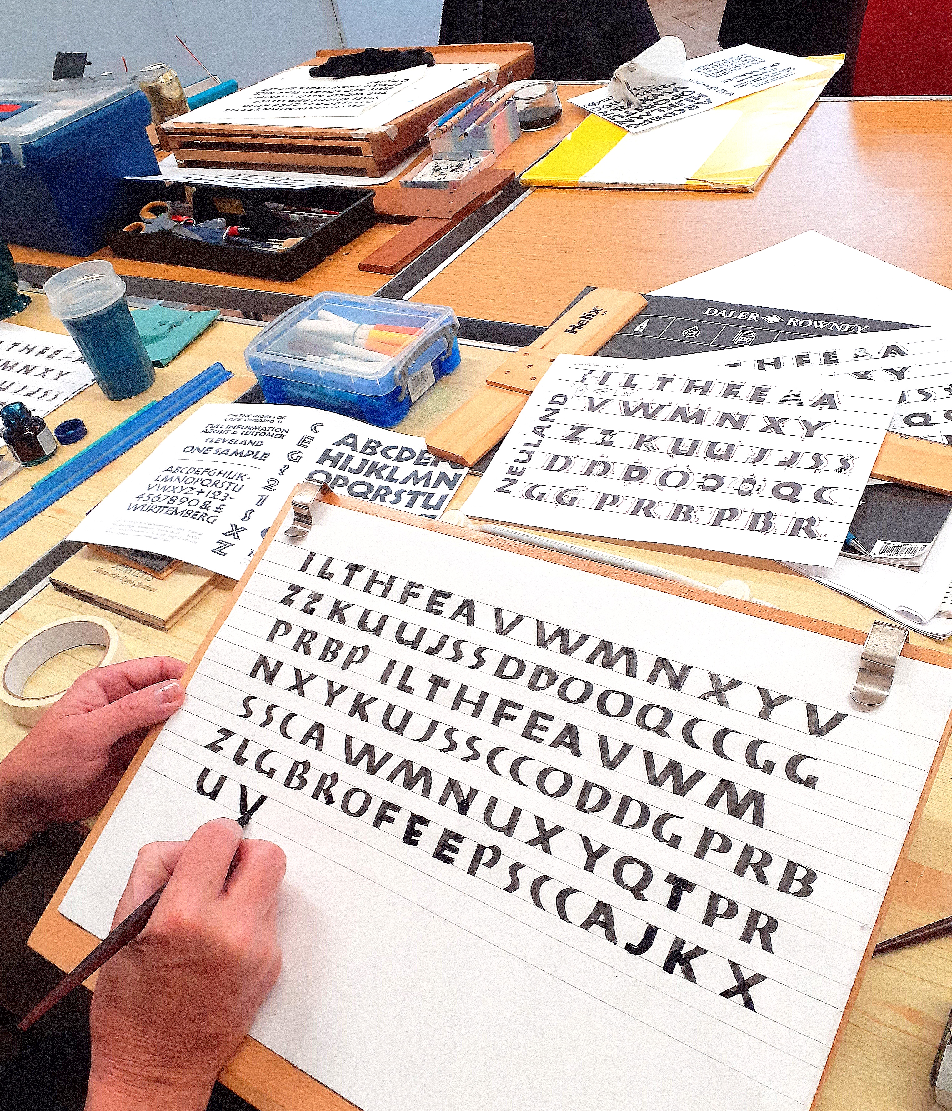
Jan Mehigan’s Workshop on ‘Neuland’ by Rudolf Koch
Rudolf Koch invented this script while working for Klingspor in Germany. His wartime experiences led him away from traditional calligraphy to use fundamental strokes to express himself in a modern way.
Jan gave us a range of examples of Neuland, including versions by Carl Rohrs, Gail Vick and Jerry Tresser. It was challenging to work in a larger than usual scale and be invited to adapt the letters in our own way. Jan’s demonstration showed us that we would need many changes of pen angle to achieve each letter. Her enthusiasm and encouragement enabled us to explore a variety of strokes to create our own versions of the letters.
Marion Mackenzie’s Workshop on ‘Ben Shahn’
Marion began by giving us a handout of text that had been written out by Ben Shahn. We then copied the letters, using a large nib, to make our own alphabet exemplar from which to work during the day.
Some letters had two or more versions; some were joined together; and there were variations in the sizes of letters within some words.
Using our exemplars we practised the lettering; with Marion encouraging variation and creativity, saying that ‘nothing would be wrong’.
The exercise for the afternoon was to write out our choice of a passage of 30-40 words.
Marion demonstrating
Example of Ben Shahn’s work
Example of Marion’s work
Students’ Work
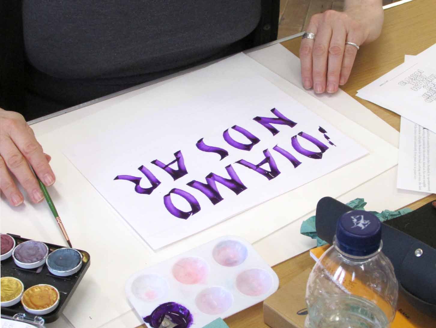
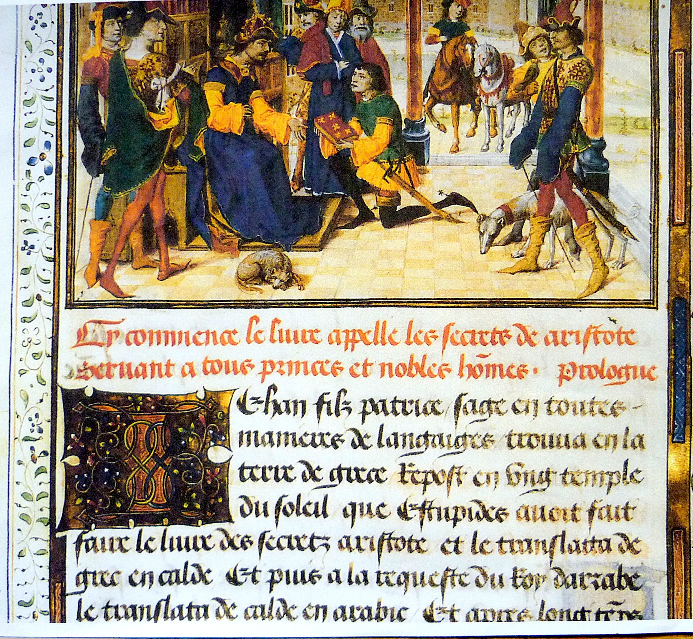
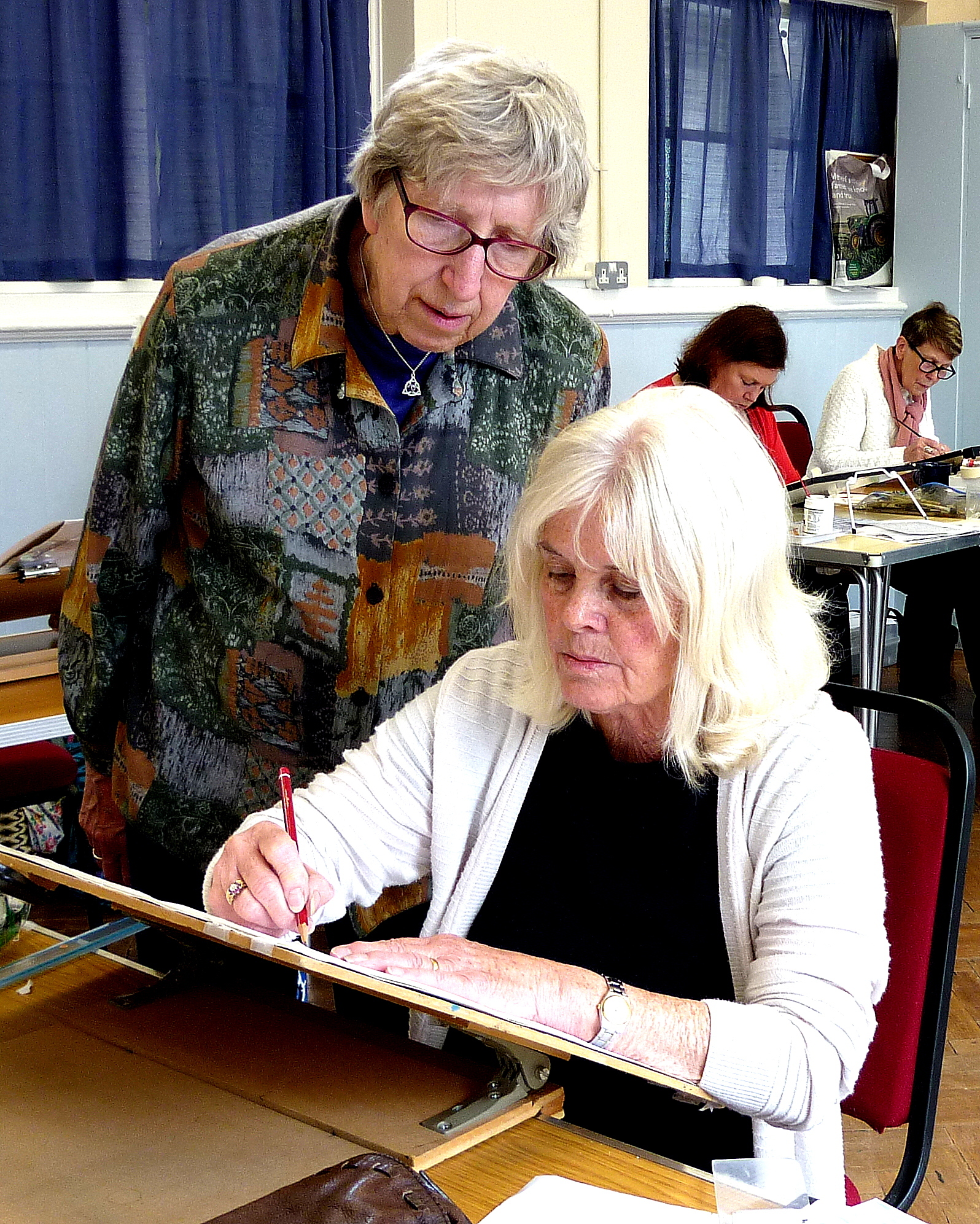
Jan Mehigan’s Workshop on Batarde
As always, Jan Mehigan’s infectious enthusiasm gave us a very enjoyable & interesting workshop, this time on the Batarde Script. This beautiful, cursive script is a 15th century French version of Gothic.
We began the workshop by tracing over copies of original scripts in order to get a feel for the letters. Jan suggested that we use fairly large nibs for this initial practice session. Our next step was to practise the letters themselves, and then words and sentences in order to become familiar with spacing.
Our final exercise was to write out a piece of script in French, in red gouache and black ink. The results using these contrasting colours were very effective and our final pieces were displayed for everyone to see at the end of the day.
13th Century Batarde

Batarde Capitals
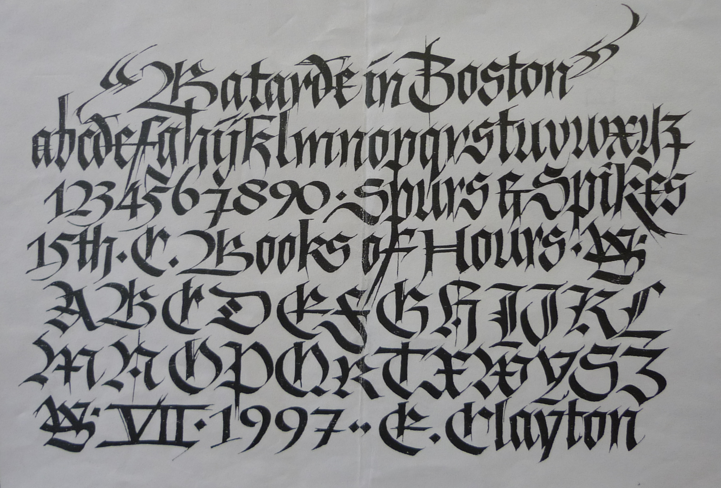
Ward Dunham’s American Version of Batarde
Concentration
Starting Off
Capitals
Irish Monk’s Cat
The Gothic Boot
Le French Version
Even More French
Nothing Changes
Beautiful Work
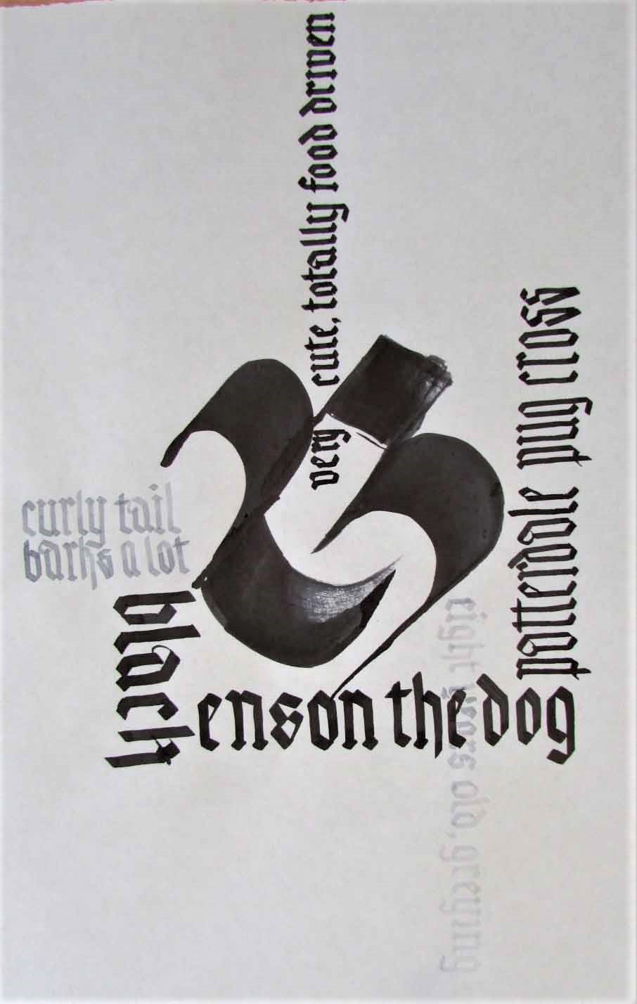
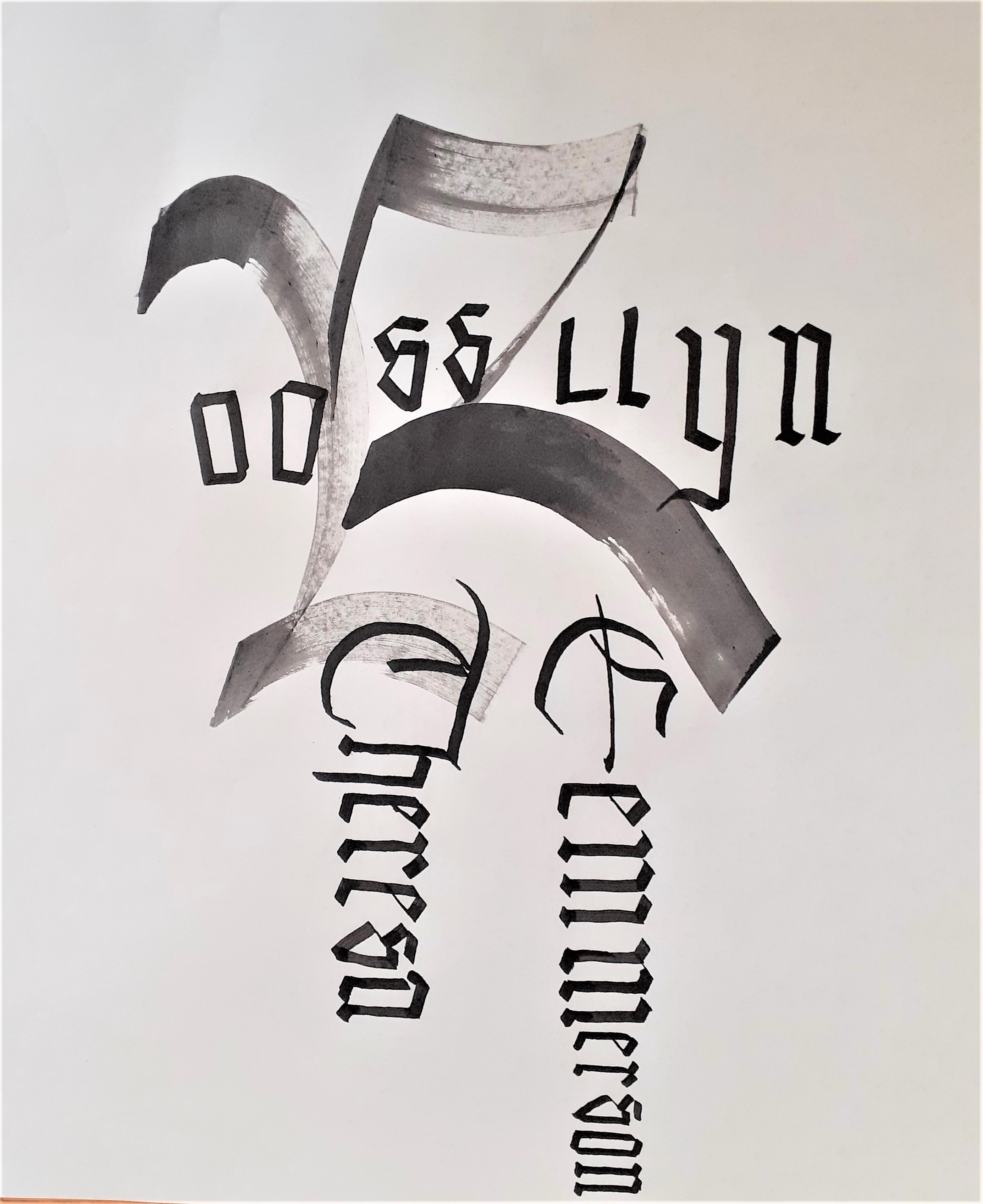
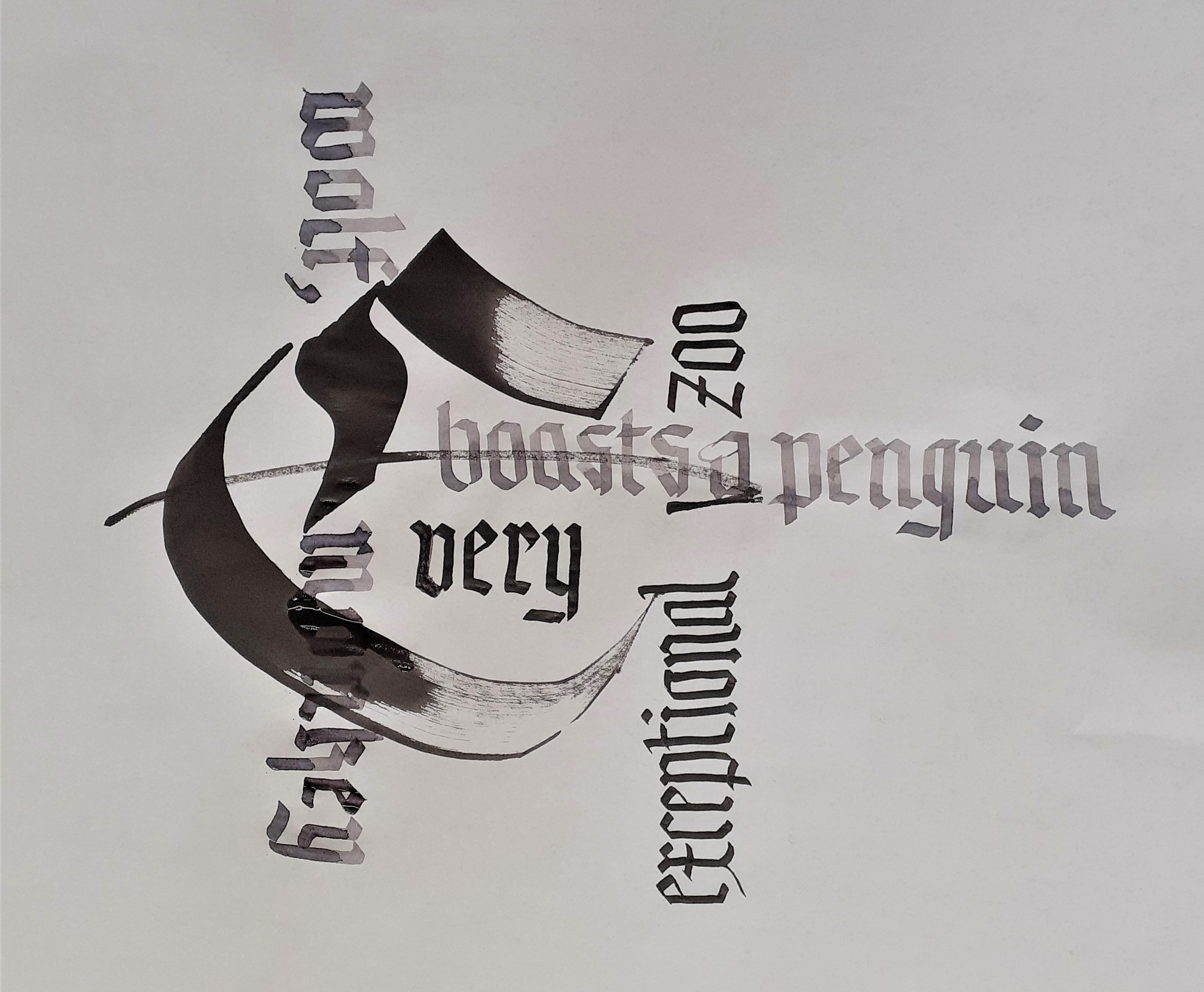
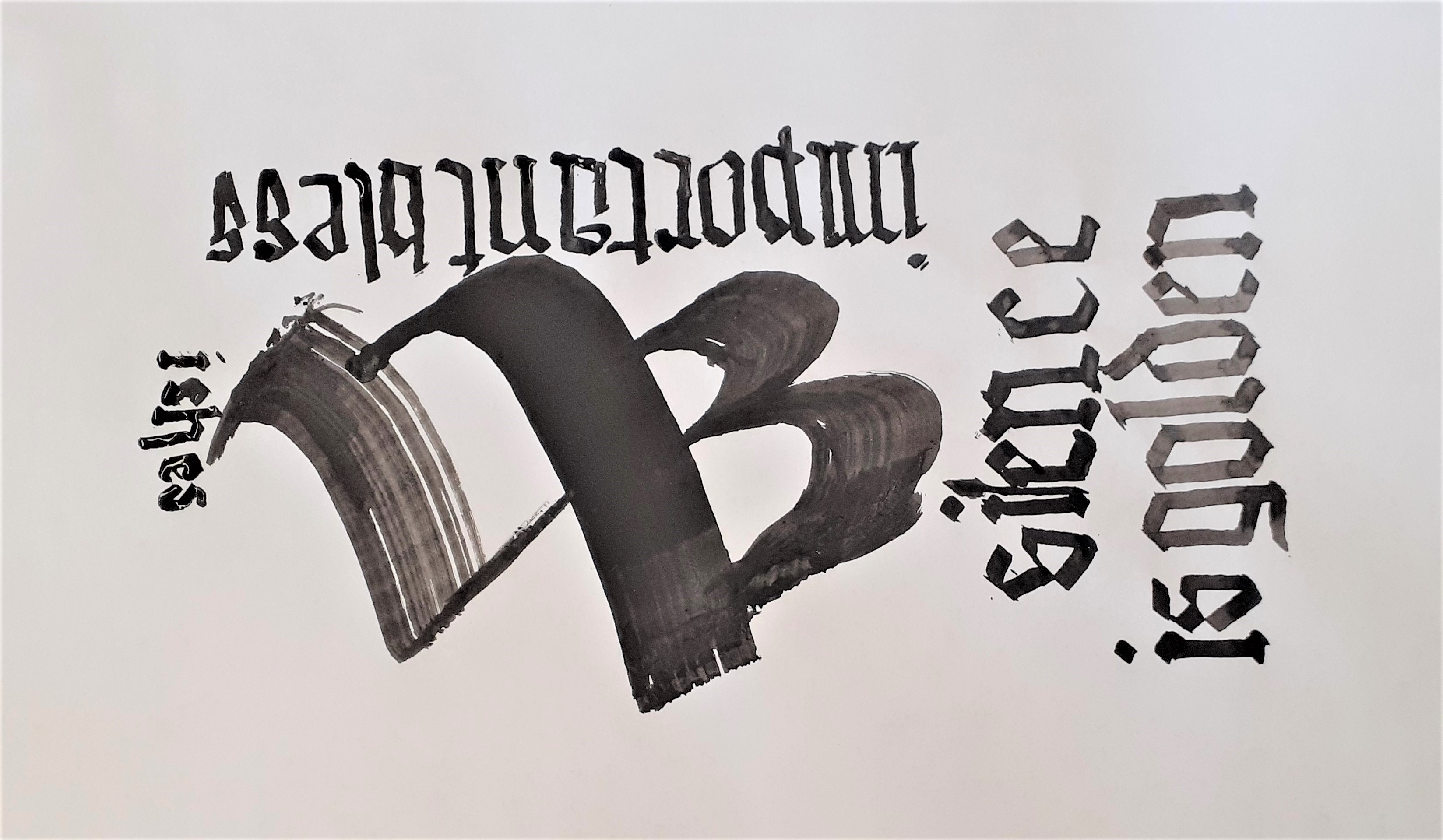
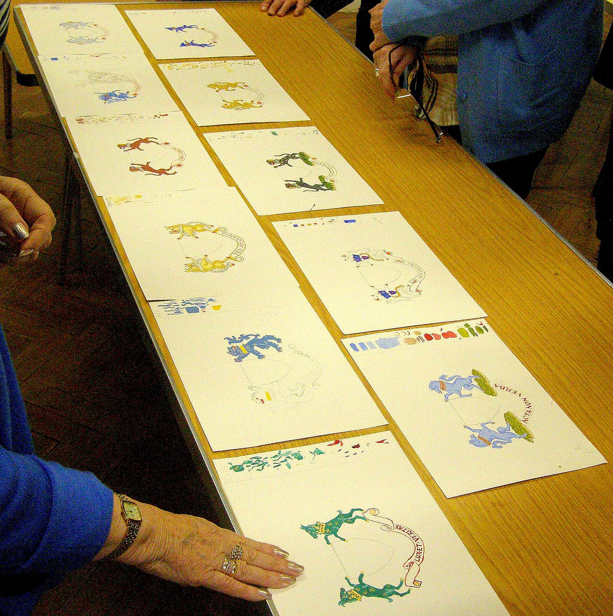
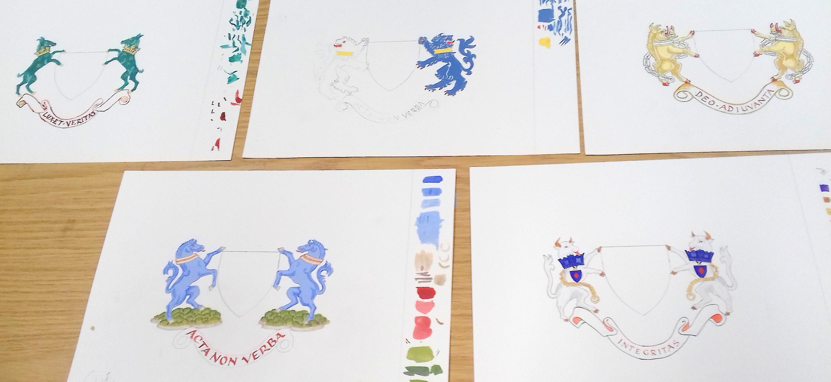
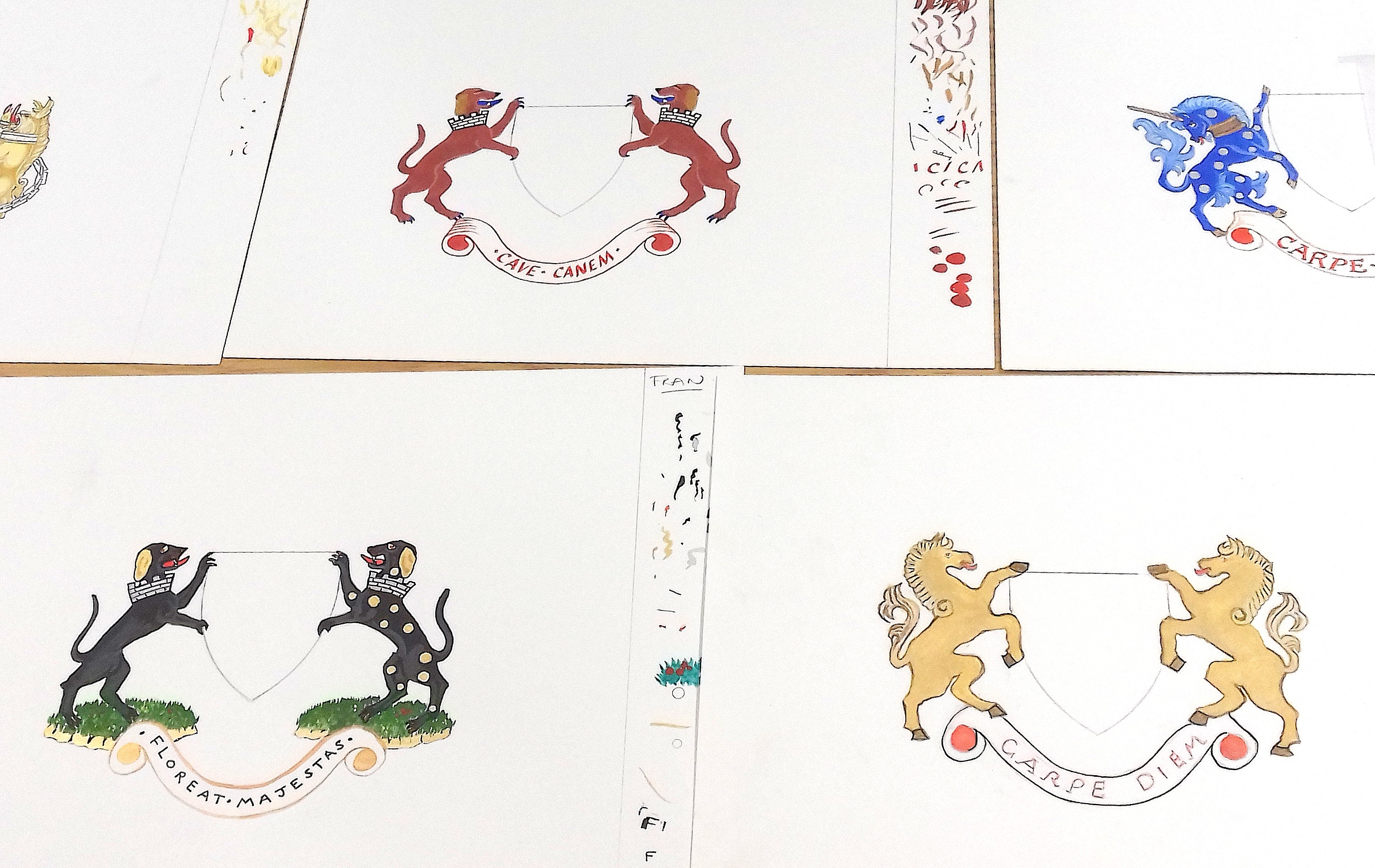
Margaret Stanley’s Workshop on Super Supporters
As expected we were treated to a very interesting and knowledgeable workshop on heraldry supporters by Margaret, a follow on to her workshop on designing Shields. Margaret began by showing us several examples of her beautiful work. We were then able to choose from a selection of traditional animal supporters including a horse, unicorn, bull, boar, goat, dog and griffin. Margaret took us through all the stages of reproducing our choice of animal and then constructing the mirror image to this. She then gave us many tips on how to paint the animals using gouache and which colours to use; how to add muscle definition and outlines. Colour schemes could either be traditional or fantasy. Outlines could either be added with a fine brush or a fine pen. Finally we added a banner and then chose a Latin motto to add to this. Margaret added that there could be a further workshop on Helms which would then complete our heraldic coat of arms.
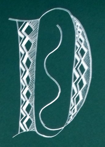
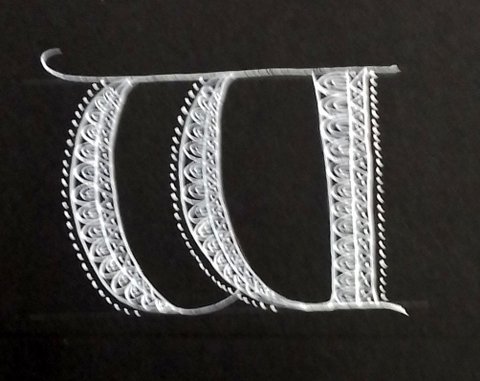
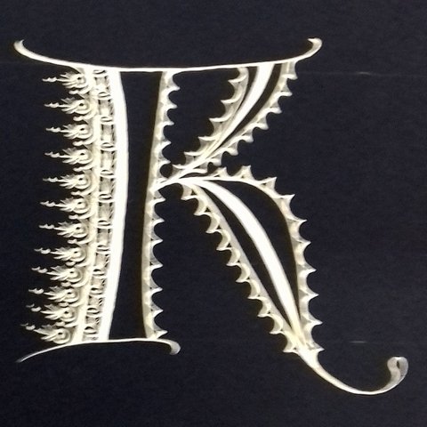
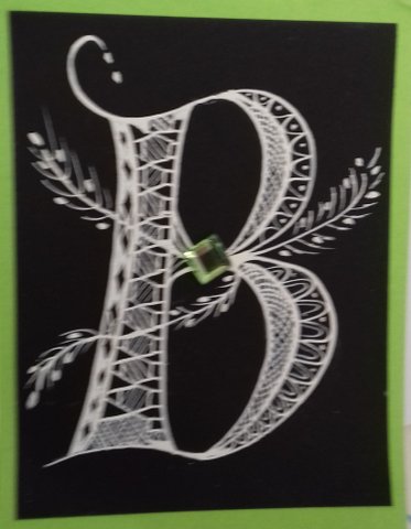
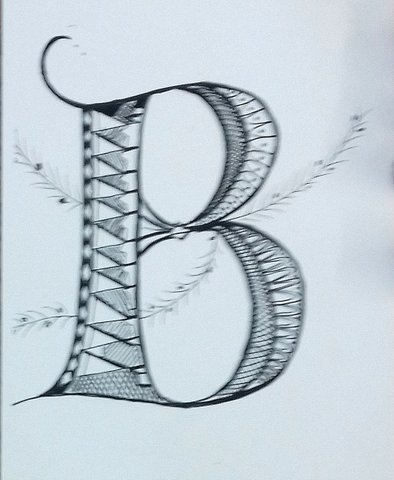
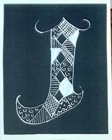
Nancy Ouchida Howell’s workshop on Lacy Letters
Members comments:
‘This was a delightful technique for decorating Versals. With quite simple patterns, using white on black (or any dark colour card), the effect was fantastic!’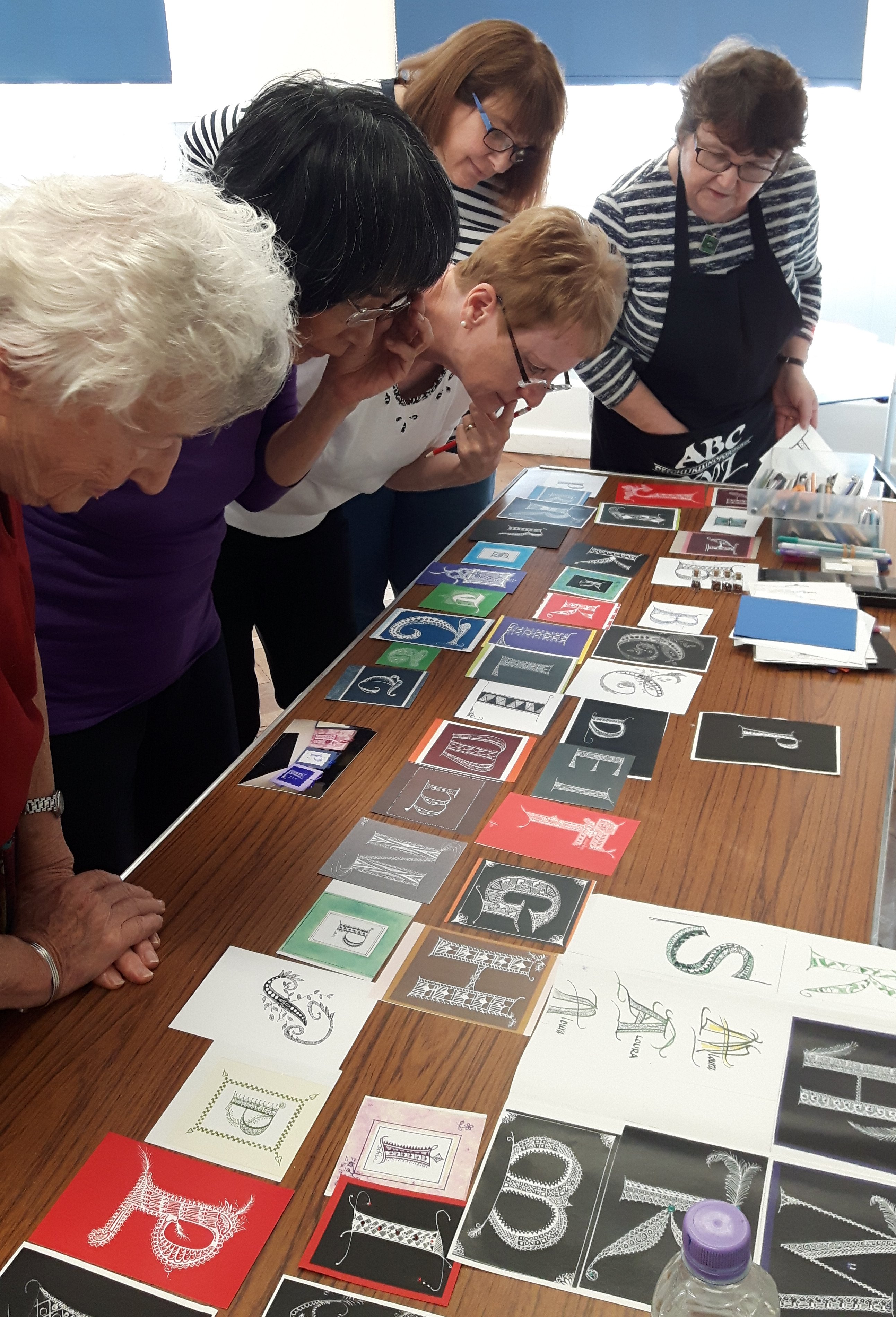
Nancy’s natural enthusiasm and encouragement made her Lacy Letters workshop great fun.
It was a really enjoyable day and we left with several ideas for future projects using her techniques.
There was a tutor named Nancy who made us write letters so fancy …. With the aid of special nibs and paint Nancy enabled us to draw some finely decorated versals.
Nancy’s demonstration of outlines of a versal letter was just the start of a gloriously enjoyable day making contrasting patterns inside and around the edge of versal letters.
A large table of students examples of versal letters decorated with such a variety of curves and straight geometric designs was an inspiration for me.
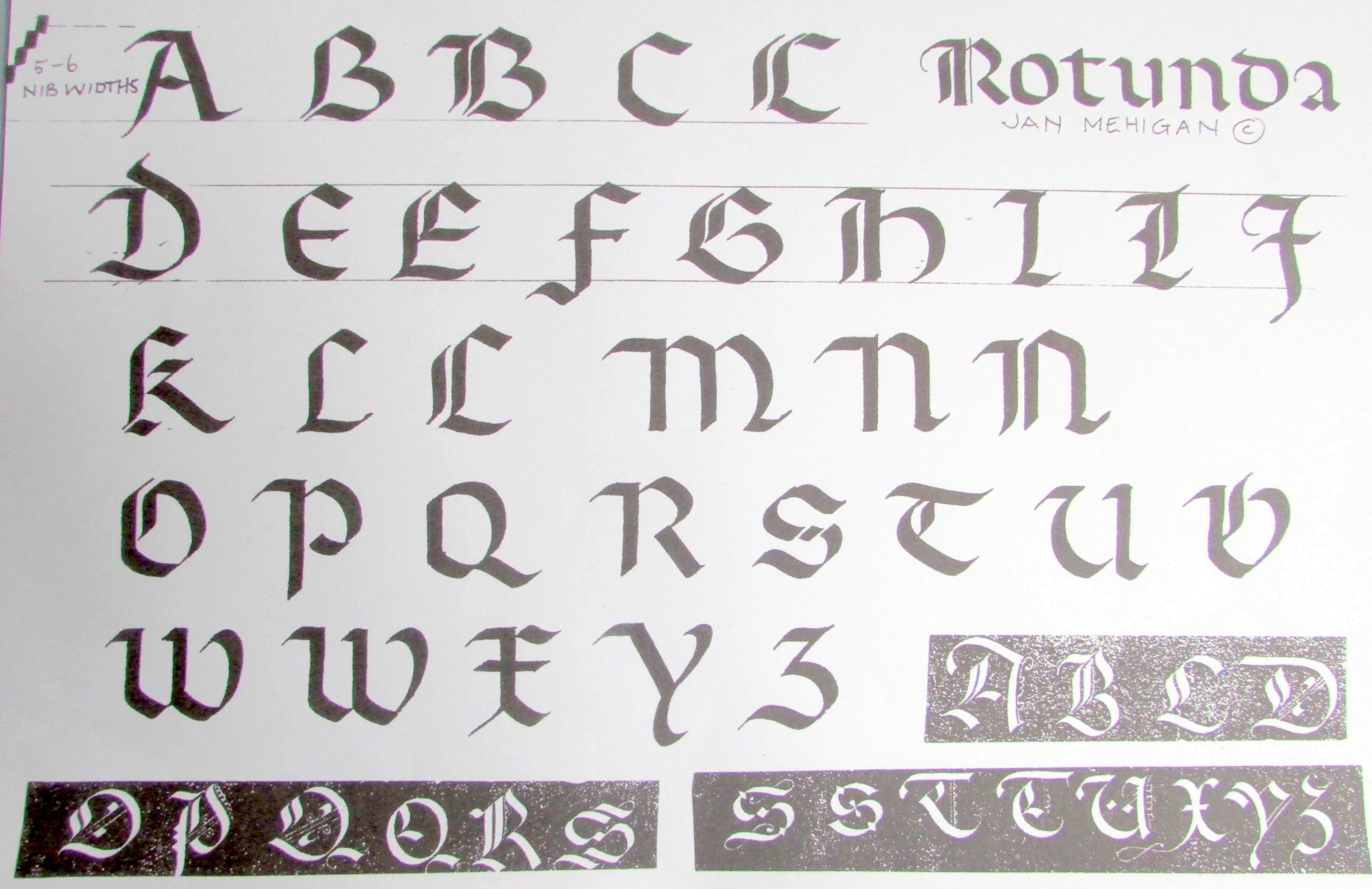
Jan Mehigan’s workshop on Rotunda
In this workshop Jan taught us the Rotunda script, both upper and lower case. This was done in a very informal and relaxed atmosphere. Jan Mehigan is an excellent communicator. The morning was spent studying the lower case letters, and during the afternoon we concentrated on upper case. To round off the day we were invited by Jan to write out a piece of text or poetry to help us practice the script. A really excellent workshop. Isabel
We had a wonderful time at our Rotunda workshop. Rotunda is a Gothic hand but more rounded in character and comes from late 15th & 16th century Italy. Jan Mehigan is a brilliant teacher and a lovely person, so easy to understand and gave us lots of support and many tips on all aspects of calligraphy. I look forward to our next workshop with Jan (who said she’d love to come back to us!). Bernie
 Jan Mehigan is a fantastic calligrapher and one of the nicest teachers of the art I’ve met; she was enthusiastic, encouraging and generous with her knowledge and support; a great day and Jan should definitely be added to the list of Lingfield Scribes’ preferred providers! Karen
JM goes without saying is very knowledgeable, skilled, ‘down to earth’ and engaging! She brought in topics about gilding and making quills and reed pens. Robin
Please thank the members of Lingfield Scribes for a lovely workshop. Jan’s message to students
Jim Linwood’s talk on Copperplate
 Jim’s talk was a very personal account of his friendship with Fred Marns and a wonderful exploration of how copperplate emerged inspite of Edward Johnston’s book Writing & Illuminating & Lettering excluding any mention of copperplate.
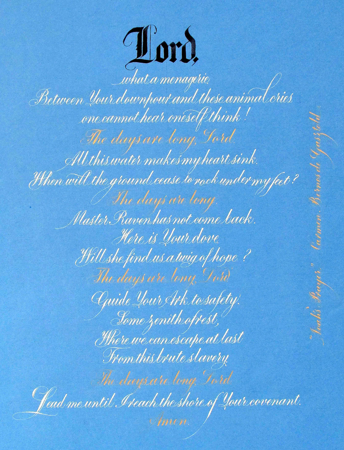
There were many examples of Jim’s work written with gold and colours on black paper and many other colours on white paper. The compositions were expressive of the poetry’s content & different ways of interpreting the words. We were able to appreciate the artistry and delicacy of Jim’s copperplate work which he kindly brought for us to see.
Jim had asked Sue for a list of members so that he could show how much he wanted everyone to enjoy a personal piece of copperplate written with their name & hoped they will keep their calligraphic interest flourishing.
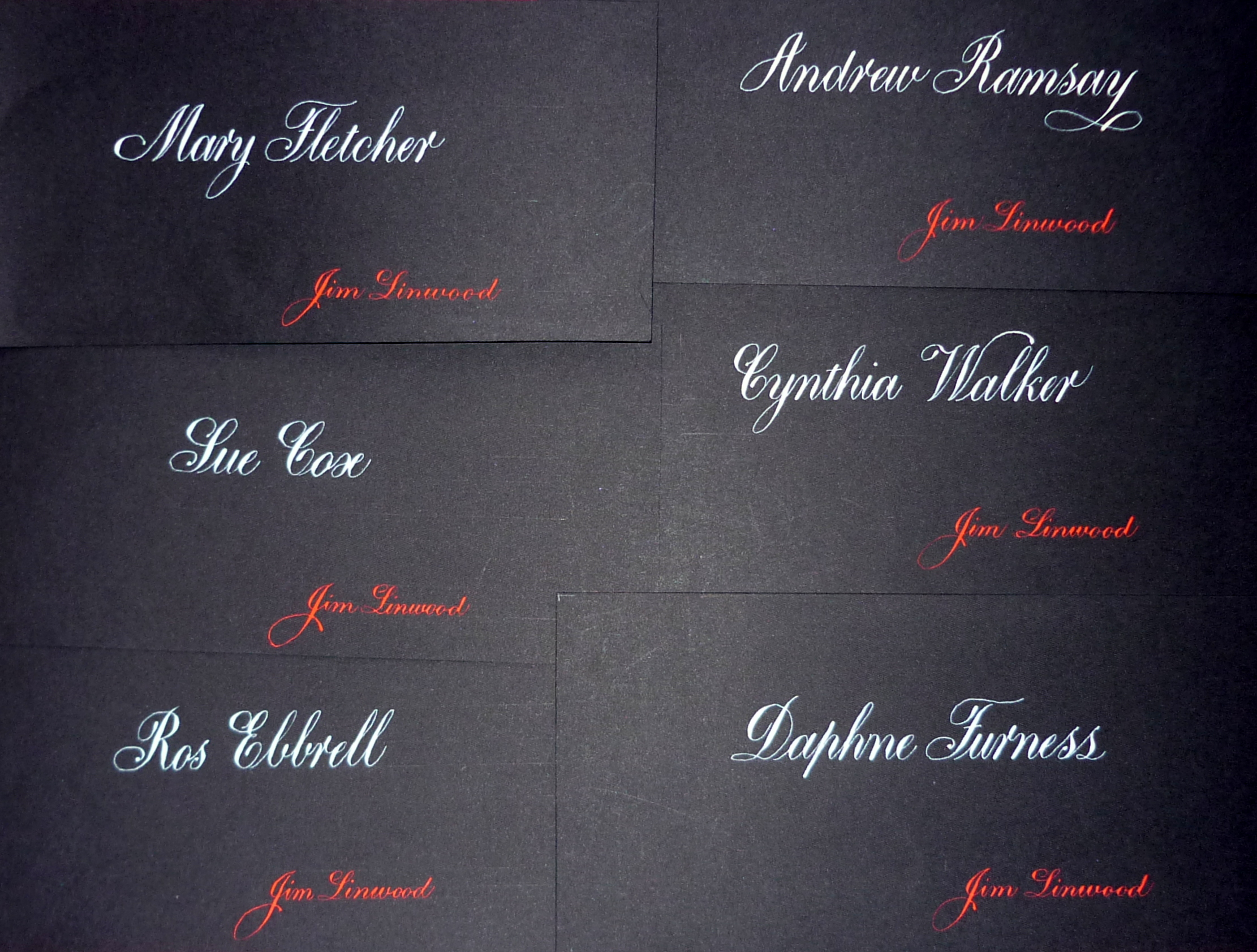
Jim is a superb exponent of the Copperplate script. His is also extremely patient and attentive when demonstrating and teaching, and the Lingfield Lovelies all enjoy our meetings with him as they struggle to improve.
 Jim was a founder member of the CSIG (Copperplate Special Interest Group) which links fellow-Copperplate folk via a quarterly magazine which consists of work submitted by those of all levels, their experience of learning Copperplate and articles on professional Copperplate calligraphers etc.
Joy Daniels runs the magazine. Incorporated into the CSIG is an envelope exchange which is optional to join. Joy then sends out a list periodically of people to send an envelope to each month. The addresses are then rotated so you have a fresh group of people each time.
Lingfield Scribes are extremely lucky to have Jim living in the locality and that he is prepared to tutor a group of members every couple of months or so, giving us invaluable guidance in our learning of Copperplate of which he is a master.
He has a genius for words and has written many, many comic verses ‘pangramericks’ using all the letters of the alphabet which he freely gives out to us so that we have the fun of using them during our practice.
He is an excellent story-teller and raconteur. Members enjoyed listening to his talk and answers to questions and seeing his expertise in the work he showed.
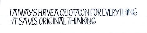
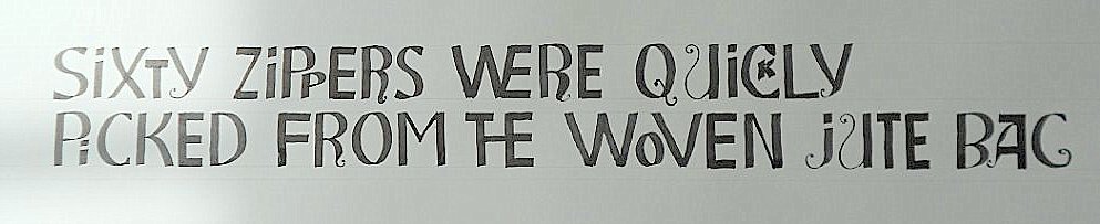
Playful with Pencils workshop
Thanks for the fun Lisa
“Lisa showed us how to draw expressive Roman Capitals with a very very sharp pencil. I enjoyed working with all the stages of classic to casual capitals freeing up habits of formal proportions.” Sue
“What a lovely day, thanks to Lisa’s patience and infectious enthusiasm I think some of us have become addicted to a new form of writing, I look forward to her coming back next year.” Andrew
“A delightful and well presented workshop. I hadn’t really used pencils for calligraphy before and it was interesting and informative to learn what could be achieved using the technique of pressure and release, and then adding colour to complete a piece of work. It is a technique I hope to use in the future.” Isabel
“I found Playing with Pencils was a FLEXIBLE and FUN script. Just to have a center line and move your letters around it was a very enjoyable break from the norm.” Judy
Are we having fun? Sue told Peter Thornton how difficult she found pressure & release. Peter “Oh I practiced it for a month before it felt natural !!”
“Fun is when you quit and go and get a martini” quote from Jim Lewis [calligrapher & graphic lettering artist USA]